Before: two apps.
Now: one cohesive tool.
GCG's health professionals were working across two separate applications to capture participant demographics, test results, medical history and workplace exposure data. The friction was real — and so was the inefficiency.
I was brought in to consolidate both into a single, purpose-built field application. That meant a full audit of existing features, stripping what wasn't earning its place, and rebuilding over 200 screens from the ground up — complete with a token-based design system and seamless light and dark mode switching.
Setting the
visual direction.
Stakeholders came in with a preferred colour palette and a rough sense of layout — my role was to elevate that into something considered. Mood boards focused on typography, iconography and information hierarchy gave the team a concrete visual language to react to before a single screen was designed.
Mood boards presented to stakeholders covering typography pairings, iconography styles, navigation patterns and colour tone — establishing alignment before any screens were built.
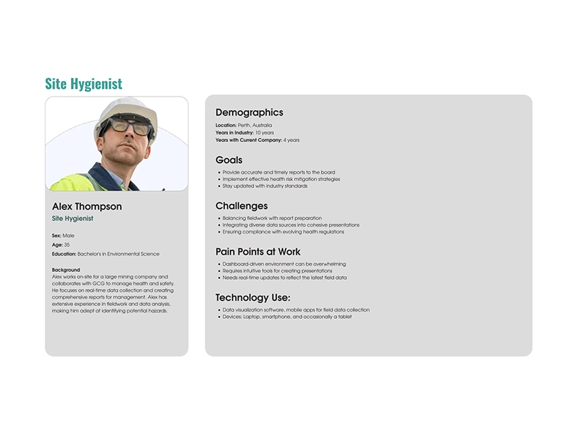
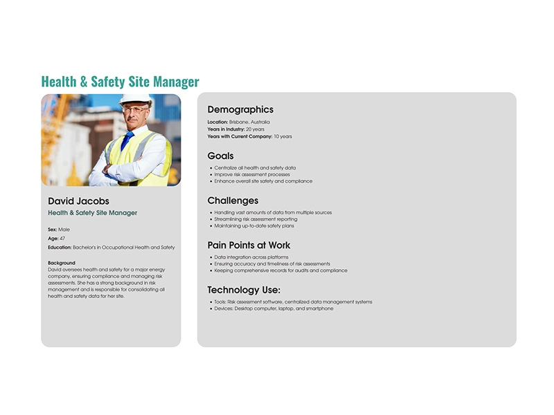
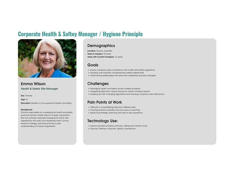
Four roles.
One application.
Before a single screen was designed, four distinct personas were identified — each using the application for a different purpose, with different security requirements and different user flows. Designing for all four simultaneously shaped every structural decision made.
Built to scale.
Designed to switch.
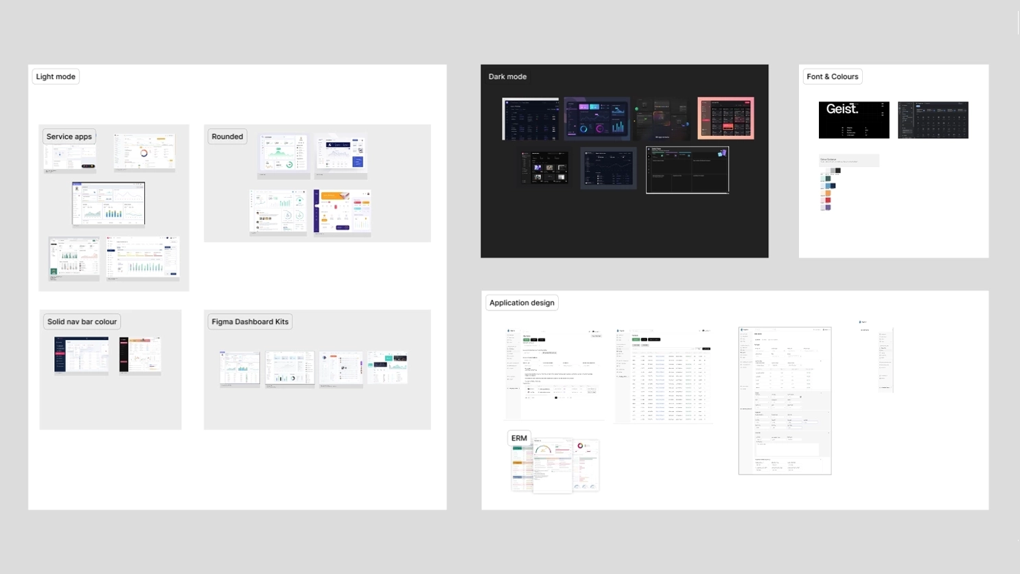
Scalability, accessibility and legibility drove every decision. Geist was chosen as the typeface — contemporary and clean, with a taller x-height and improved ligatures over the more common Inter. The primary palette was green, chosen deliberately to reinforce health and wellbeing. All iconography pulled from Google's Material Design 3 system for consistency and recognisability.
The real power sits in the token architecture. One variable switch in Figma toggles every screen between light and dark mode — or any colour theme the client needs. That's the difference between a design and a design system.
Light & Dark Mode
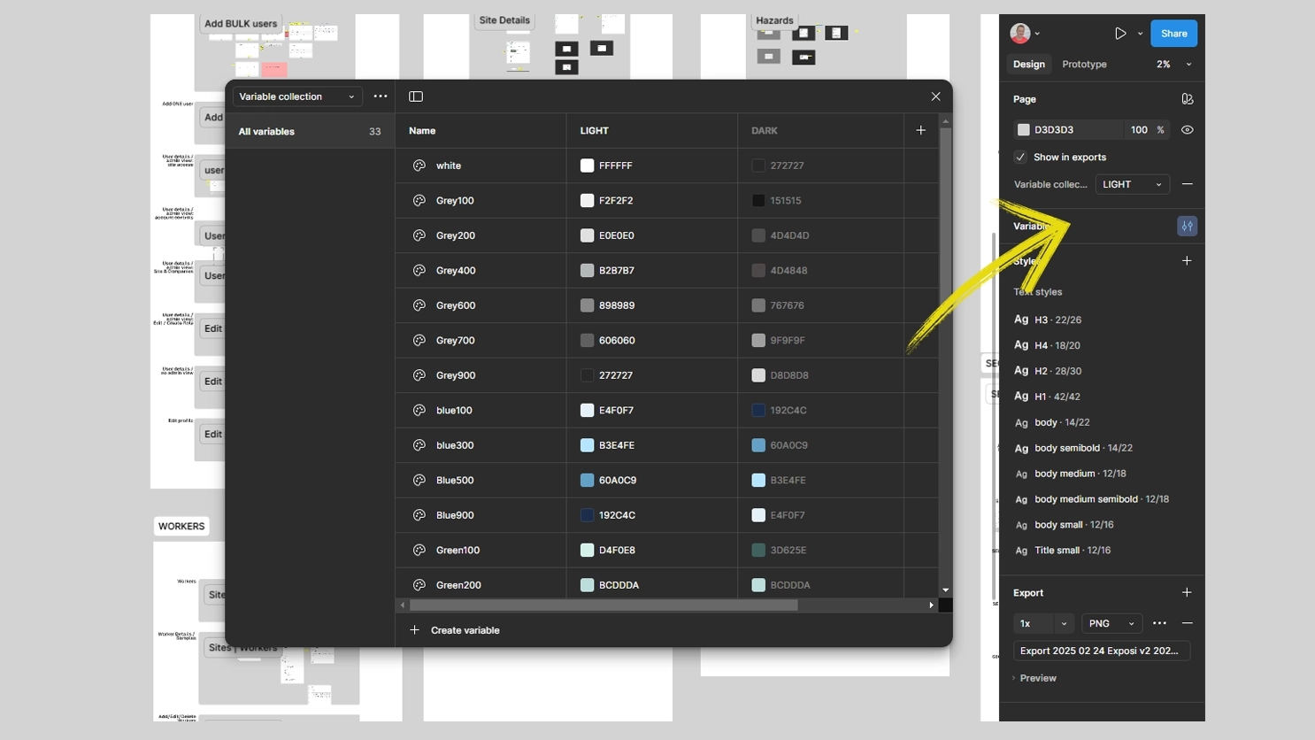
A Figma variable switch flipping every screen between light and dark mode in real time — no manual overrides, no maintenance overhead.
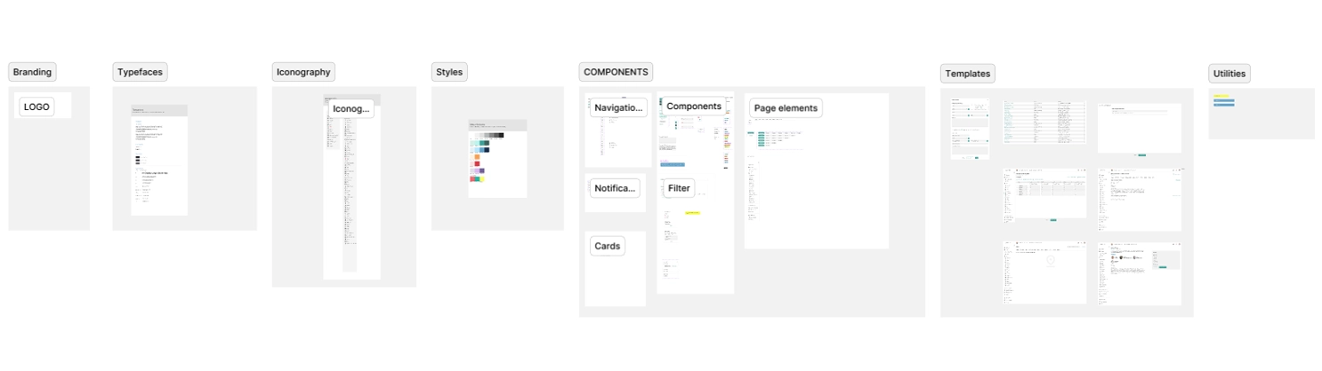
UI Kit & Token Library
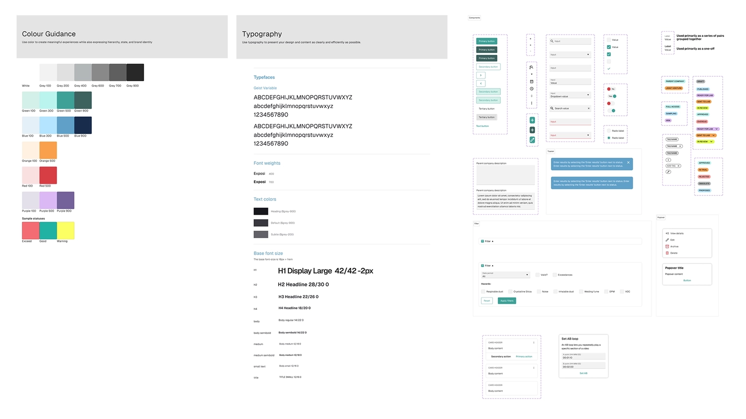
A comprehensive token-based UI kit covering all components, styles and guidelines — the single source of truth that kept 200+ screens consistent from first screen to last.
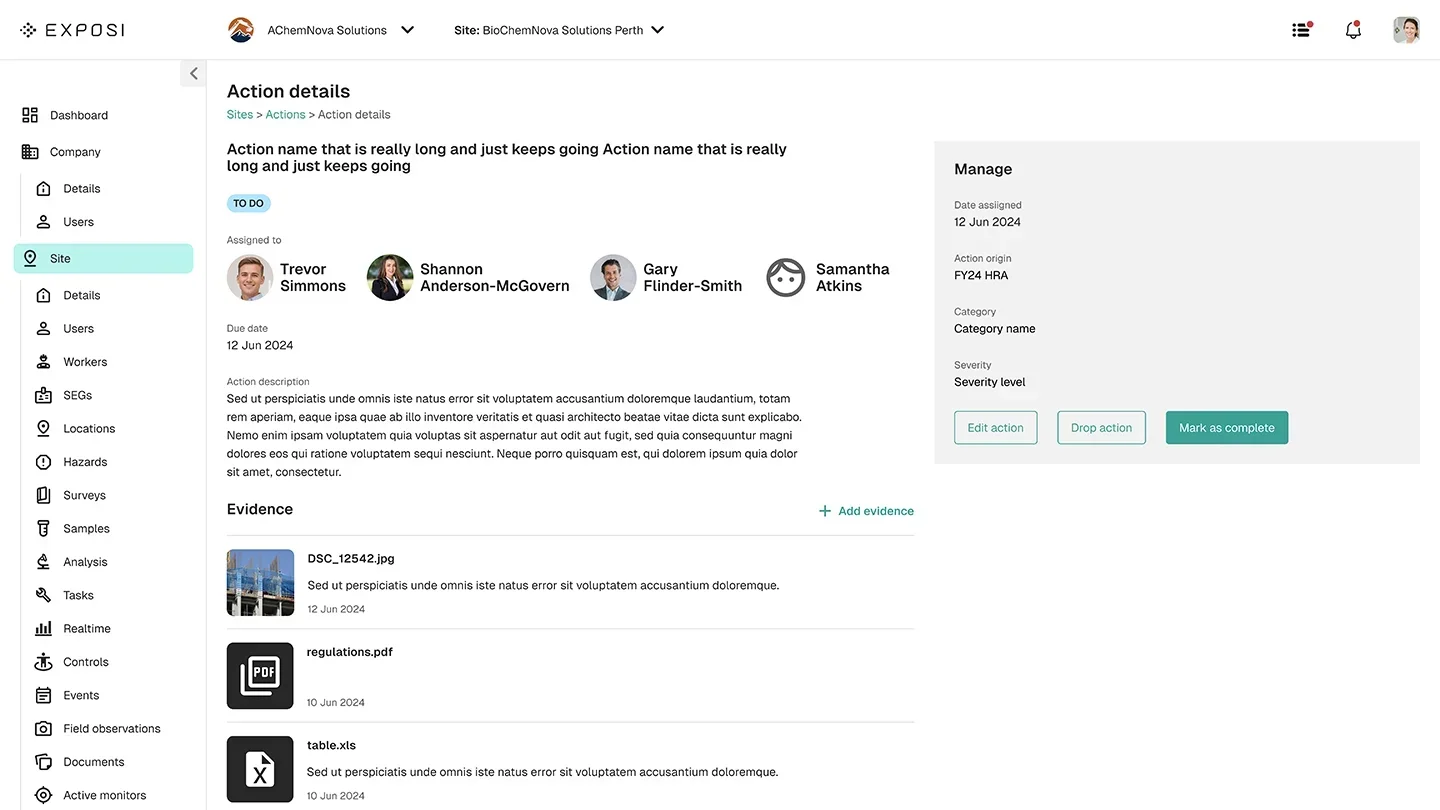
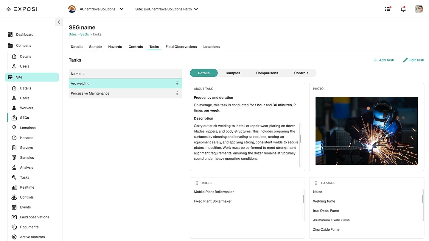
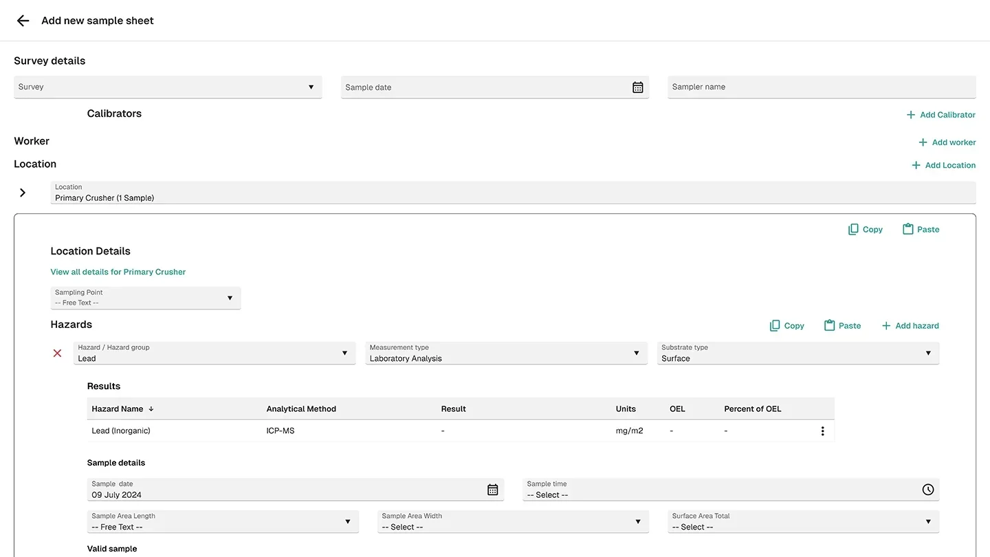
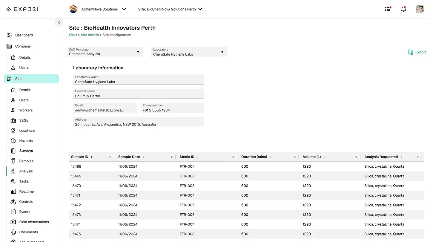
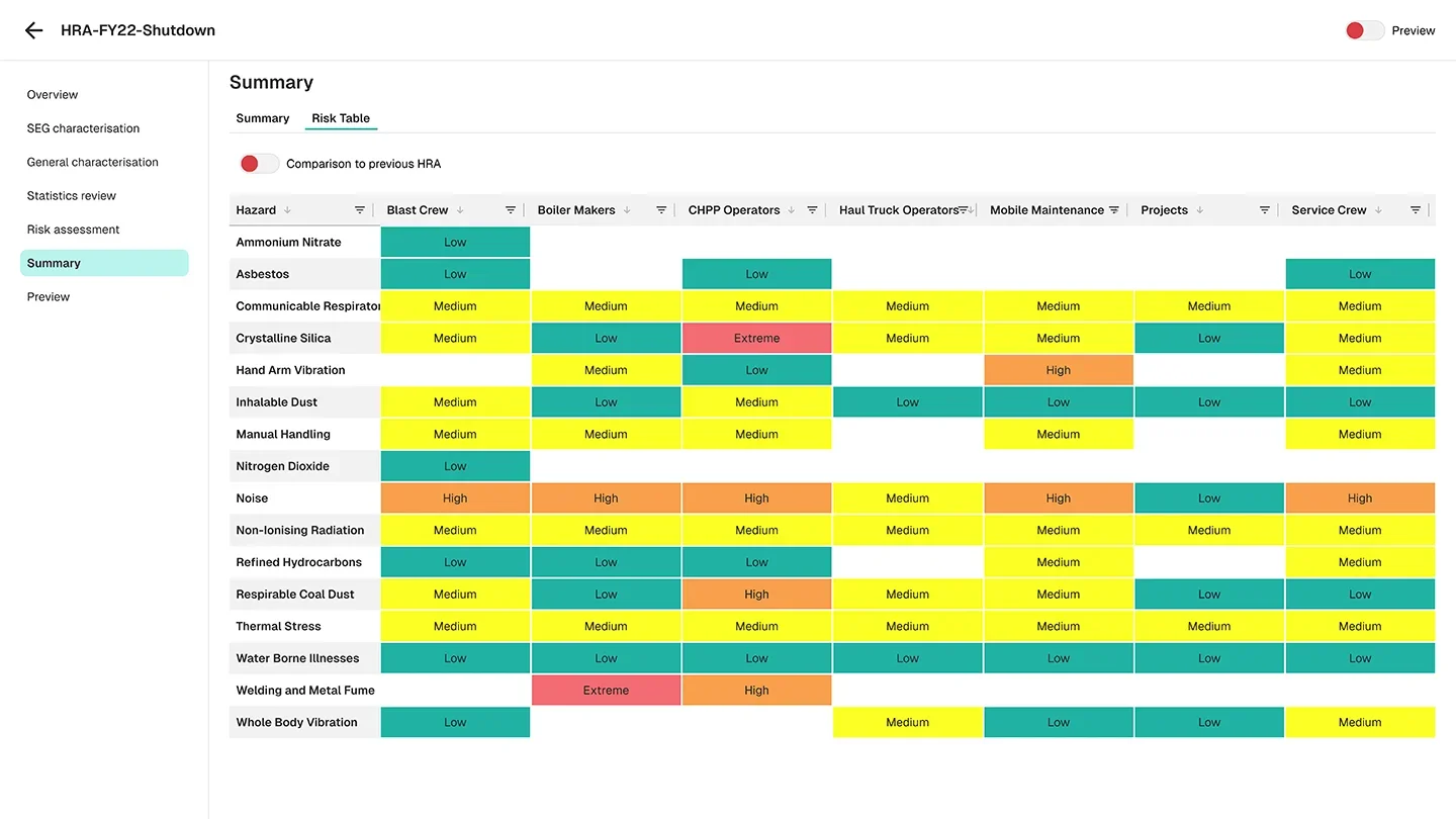
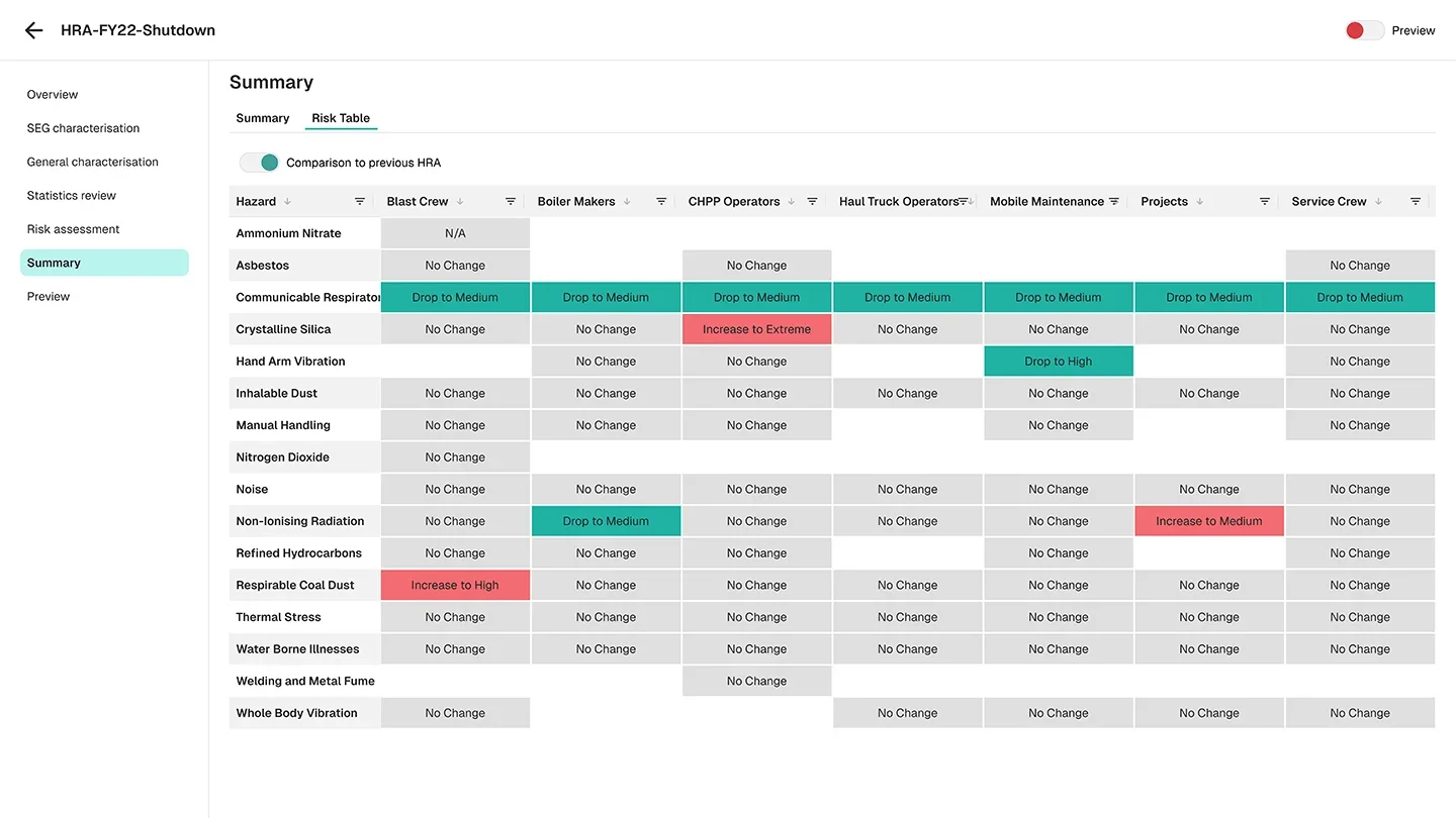
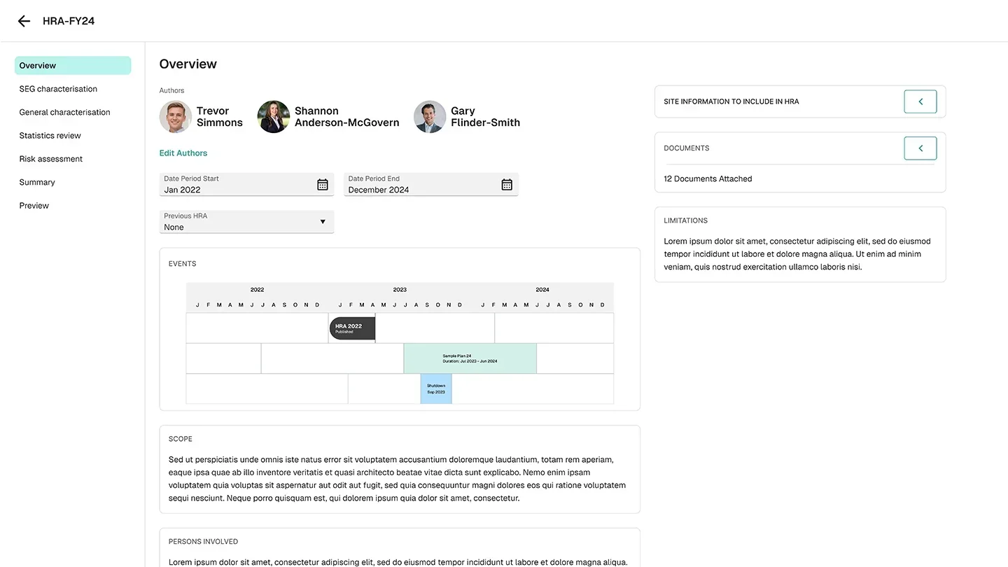
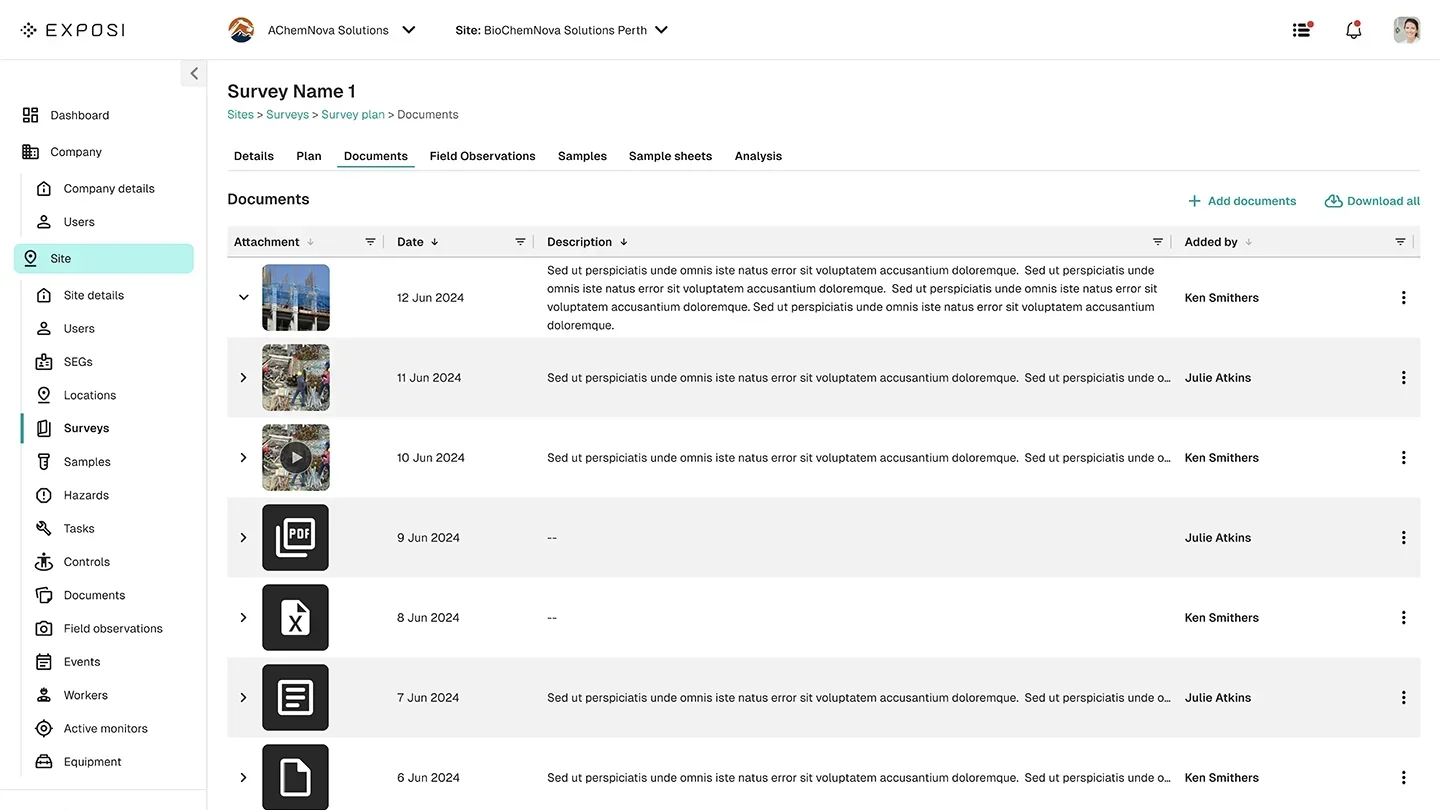
200+ screens.
Every user flow covered.
This was a large-scale project requiring deep immersion in occupational health vernacular, site hygienist workflows and industry-specific data capture. Every screen was prototyped to allow stakeholders to navigate the full experience before a line of code was written.
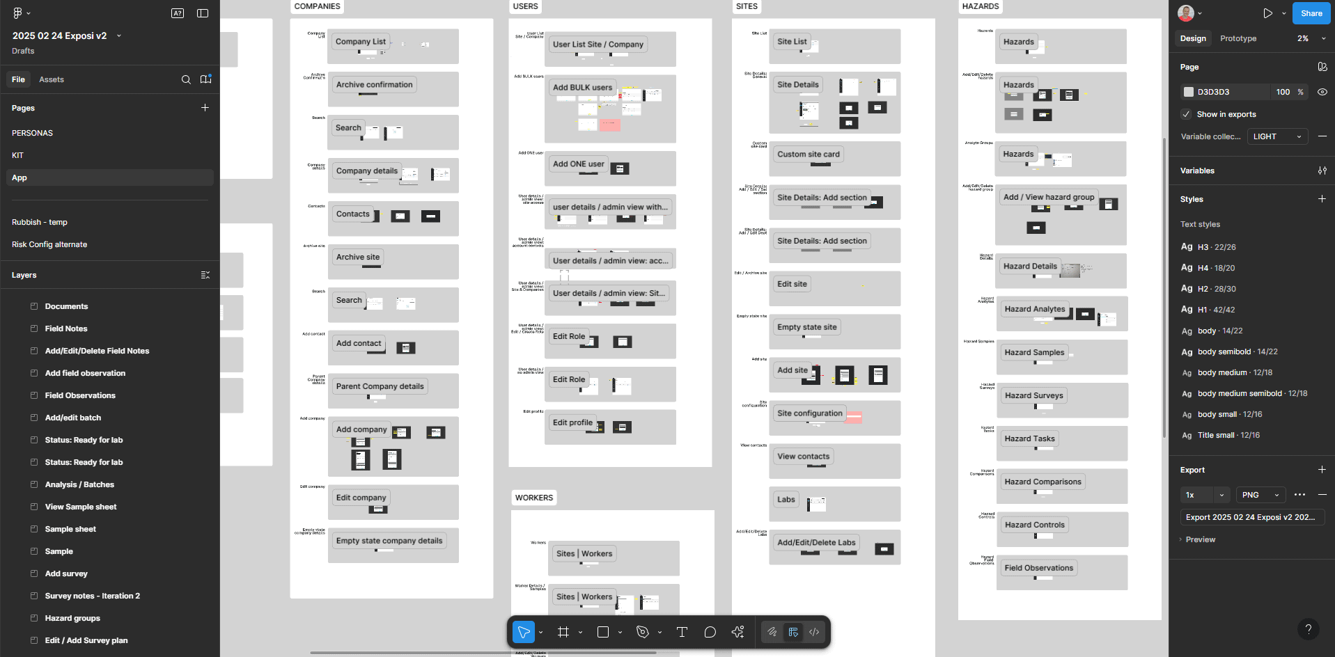
A walkthrough of the prototyped screens covering the core user flows — from participant onboarding through to health data capture and analysis.
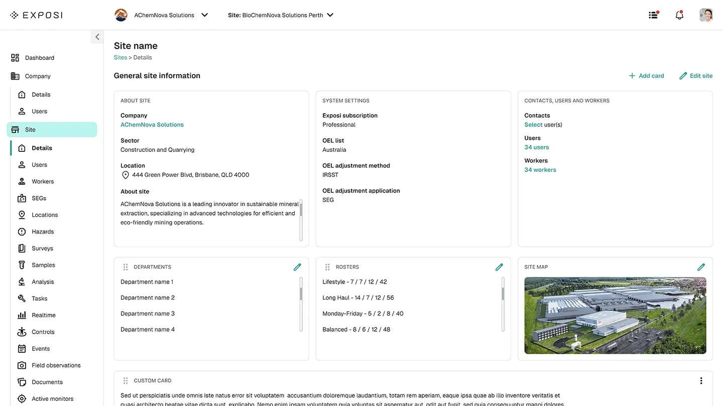
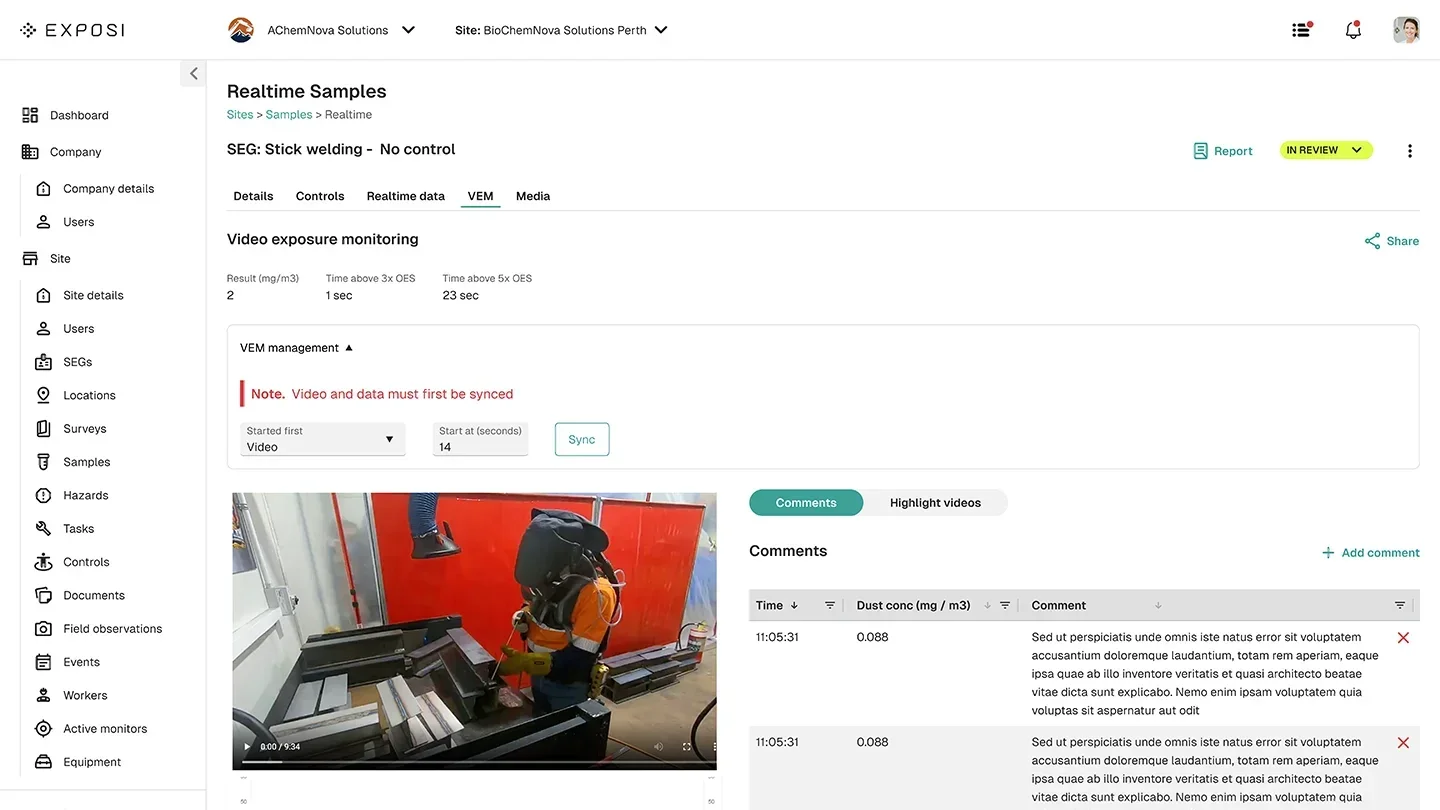
The big reveal.
This is a data-intensive application — most screens aren't built for eye candy, and they shouldn't be. The goal was efficiency and clarity for health professionals under real working conditions. The result is a single, cohesive tool that lets site hygienists navigate across companies and sites, record health and safety data, and have it analysed in a way that's actually delightful to use.