Gutting a legacy app
without losing its soul.
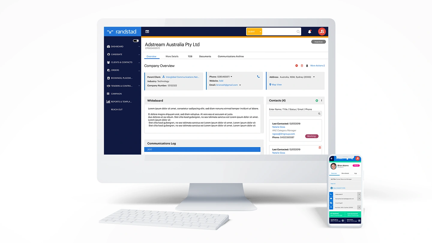
Randstad is one of the world's largest recruitment firms — and their internal application, used daily by hundreds of consultants to manage candidates, clients and placements, had become a genuine liability. Originally built as a Windows-only desktop install, it had accumulated years of feature bloat, an outdated interface and a user experience that was actively slowing people down.
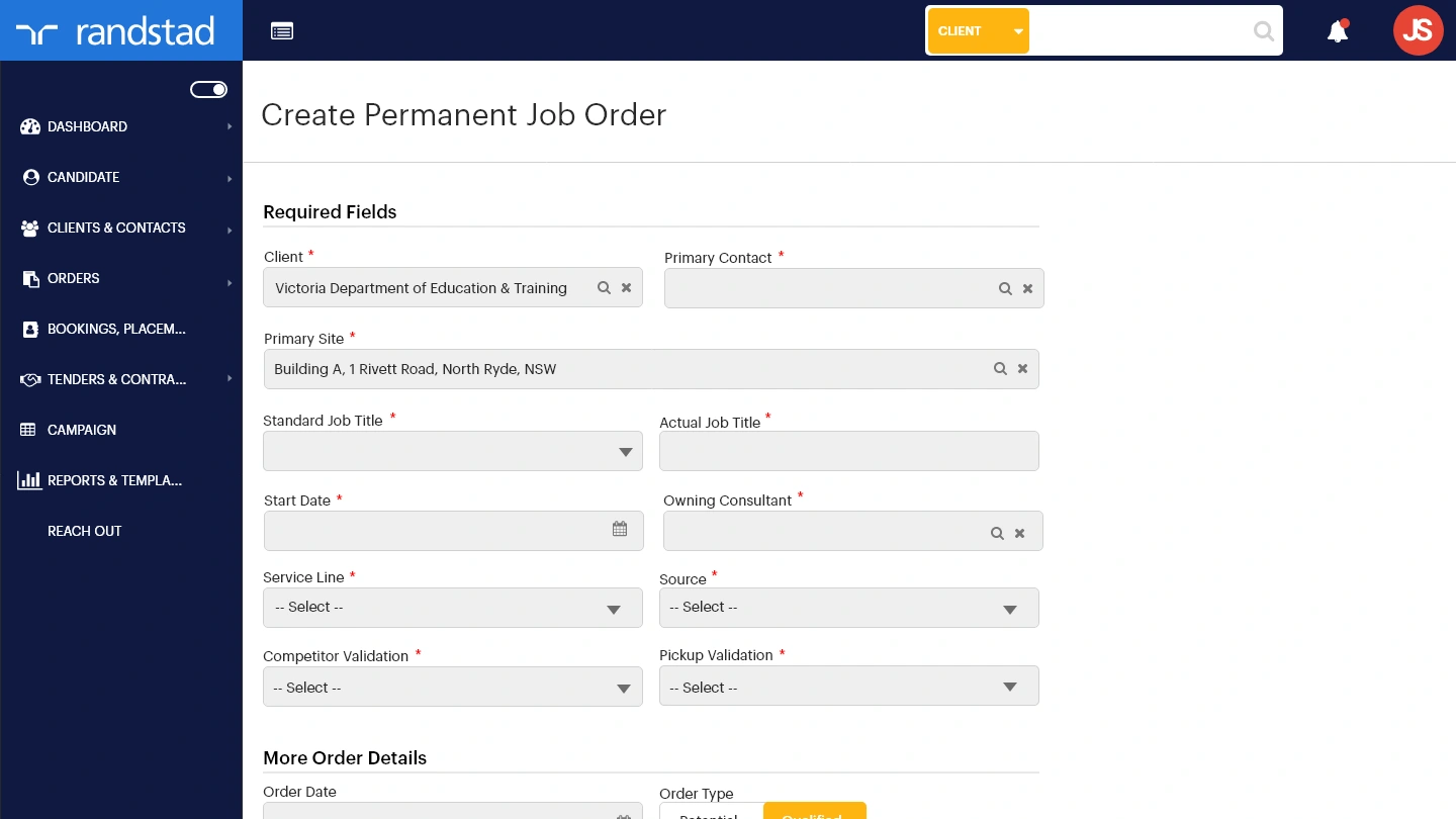
I was brought in to gut it and rebuild the experience from the ground up — stripping the feature set back to what consultants actually needed, redesigning the information hierarchy, and delivering a fully responsive, cloud-based application that works across every device. Recruiters shouldn't need to be at their desk to do their job.
Shadow first.
Design second.
Before any wireframes, I shadowed four recruiters in their day-to-day work — watching how they moved through the application, where they slowed down, what they avoided and what workarounds they'd built for themselves. That fieldwork revealed far more than any requirements document would have.
Three critical UX failures emerged consistently across every session. Those three problems became the primary design brief.
UX Focus 01 — Global Search
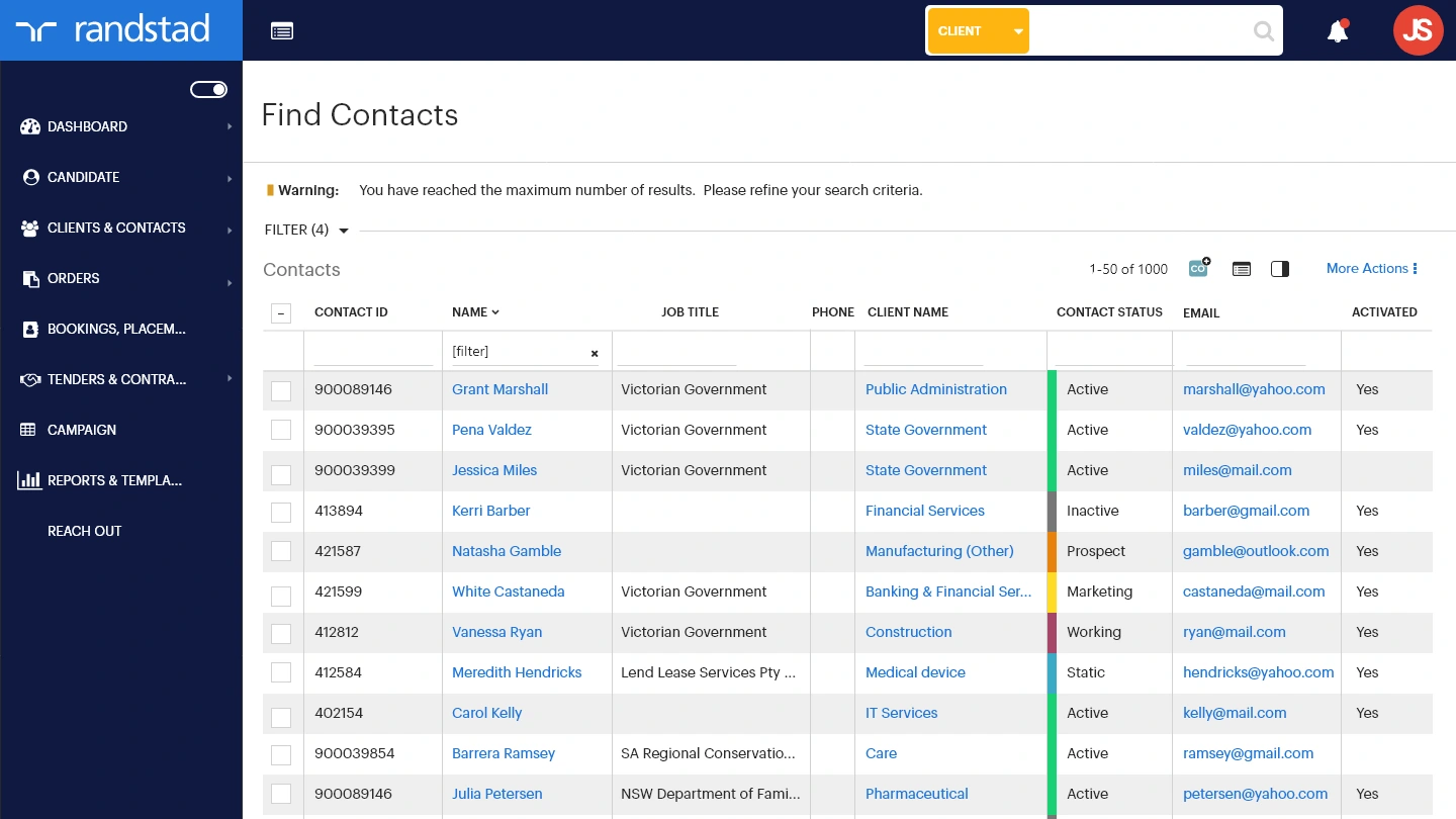
The existing search was tucked away, icon-driven and limited to candidate name only — phone numbers, reference numbers and contact details couldn't be searched at all. Recruiters had developed manual workarounds that cost them minutes on every single candidate lookup.
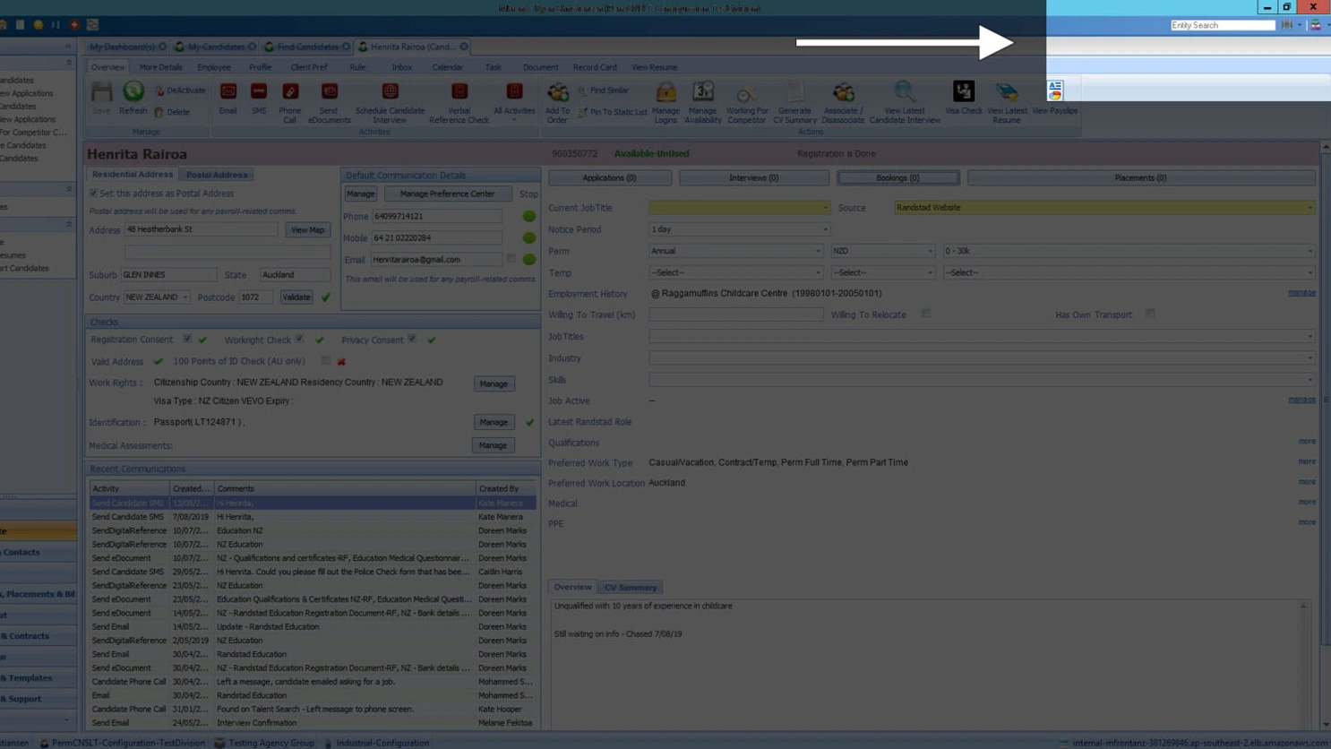
Before — hidden, icon-heavy, name-only search
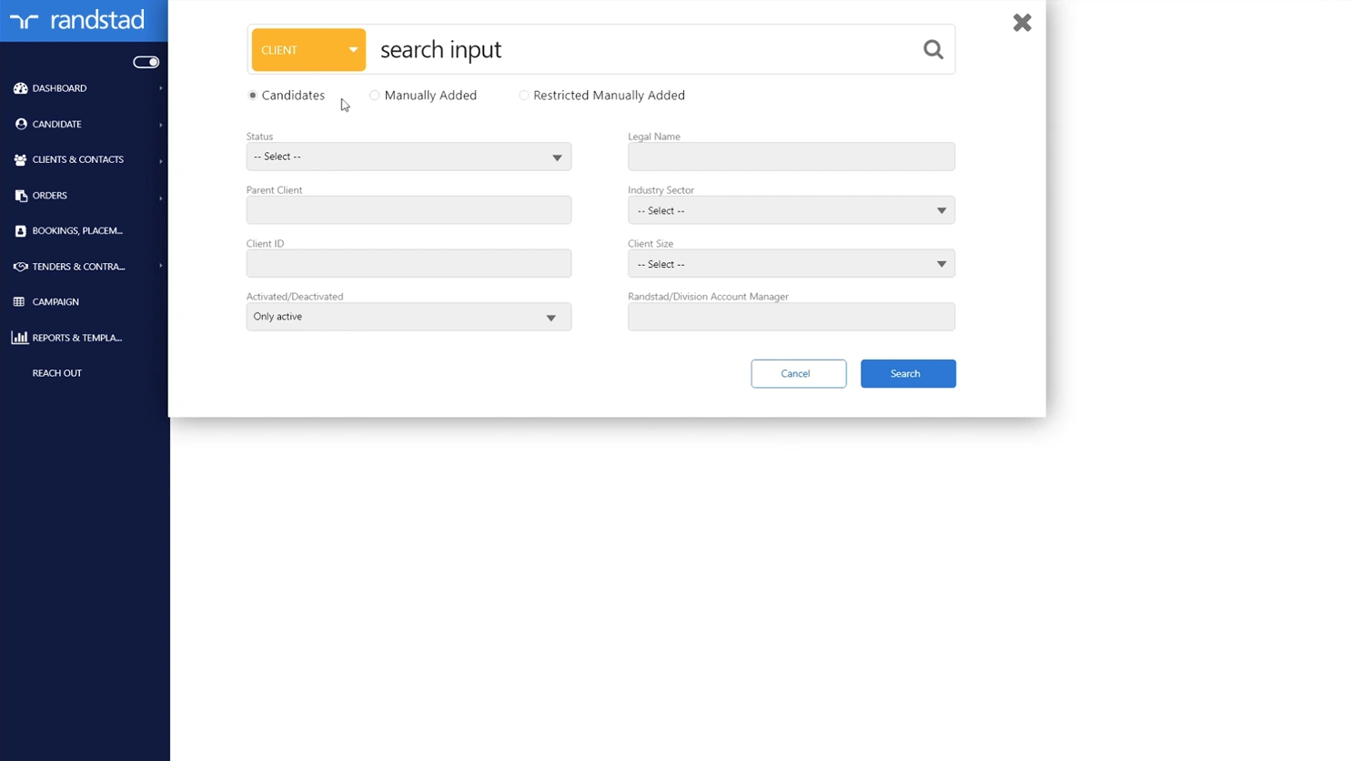
After — prominent, universal search across all data types
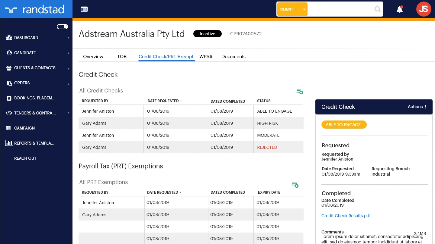
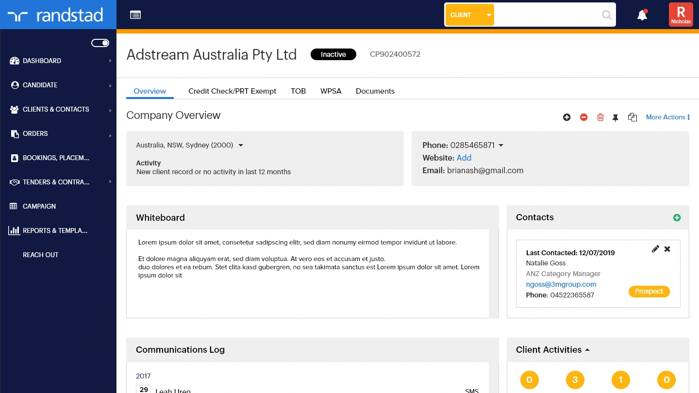
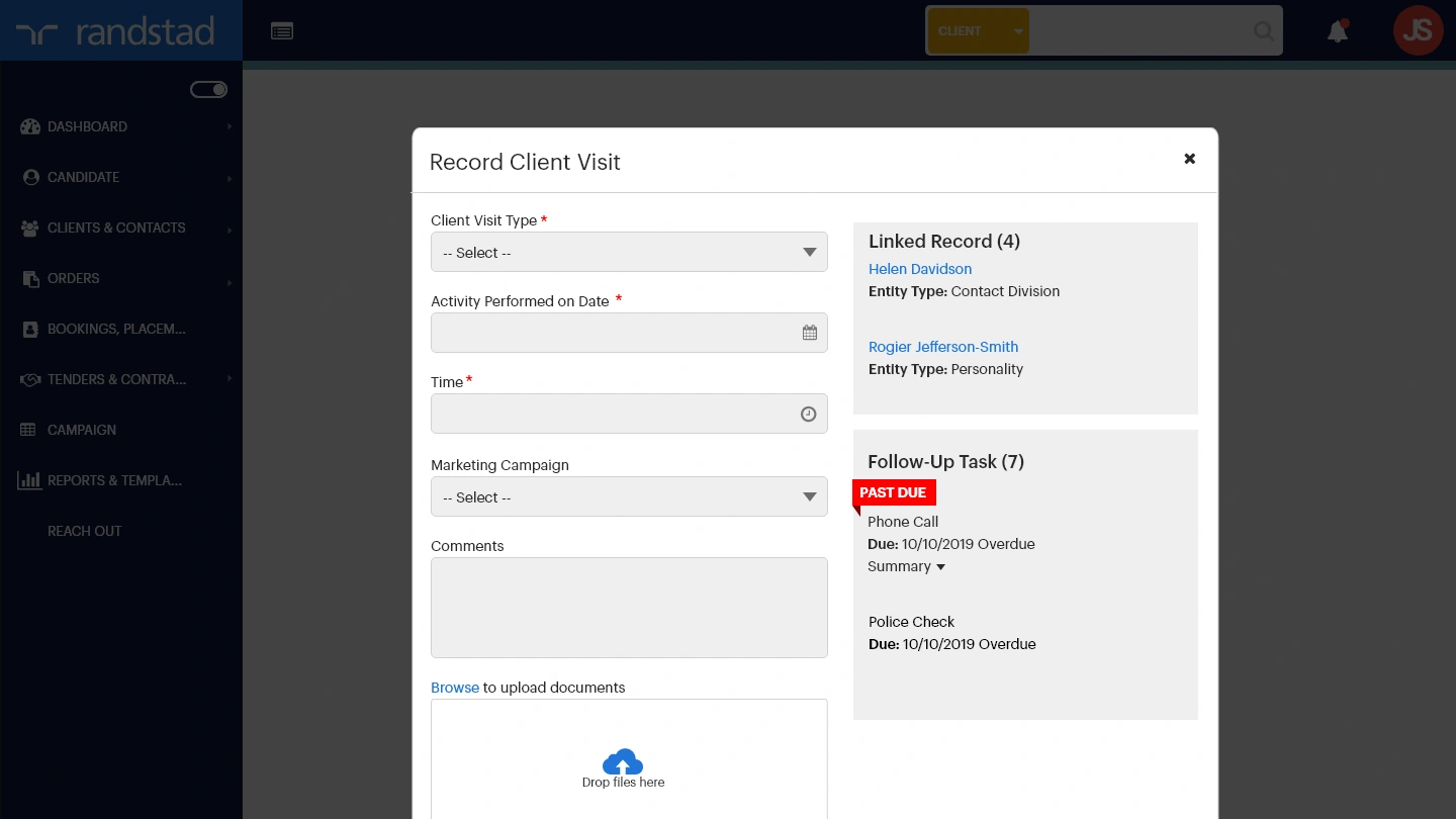
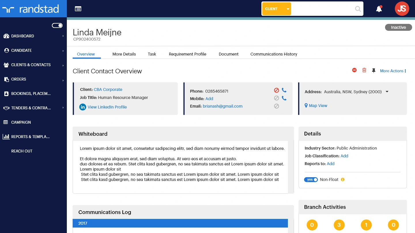
UX Focus 02 — Candidate Whiteboard
Notes left by one recruiter would frequently go unread by another because the whiteboard was buried below the fold, invisible unless you scrolled. A strict character limit also forced consultants to truncate critical information or move it to external systems entirely.
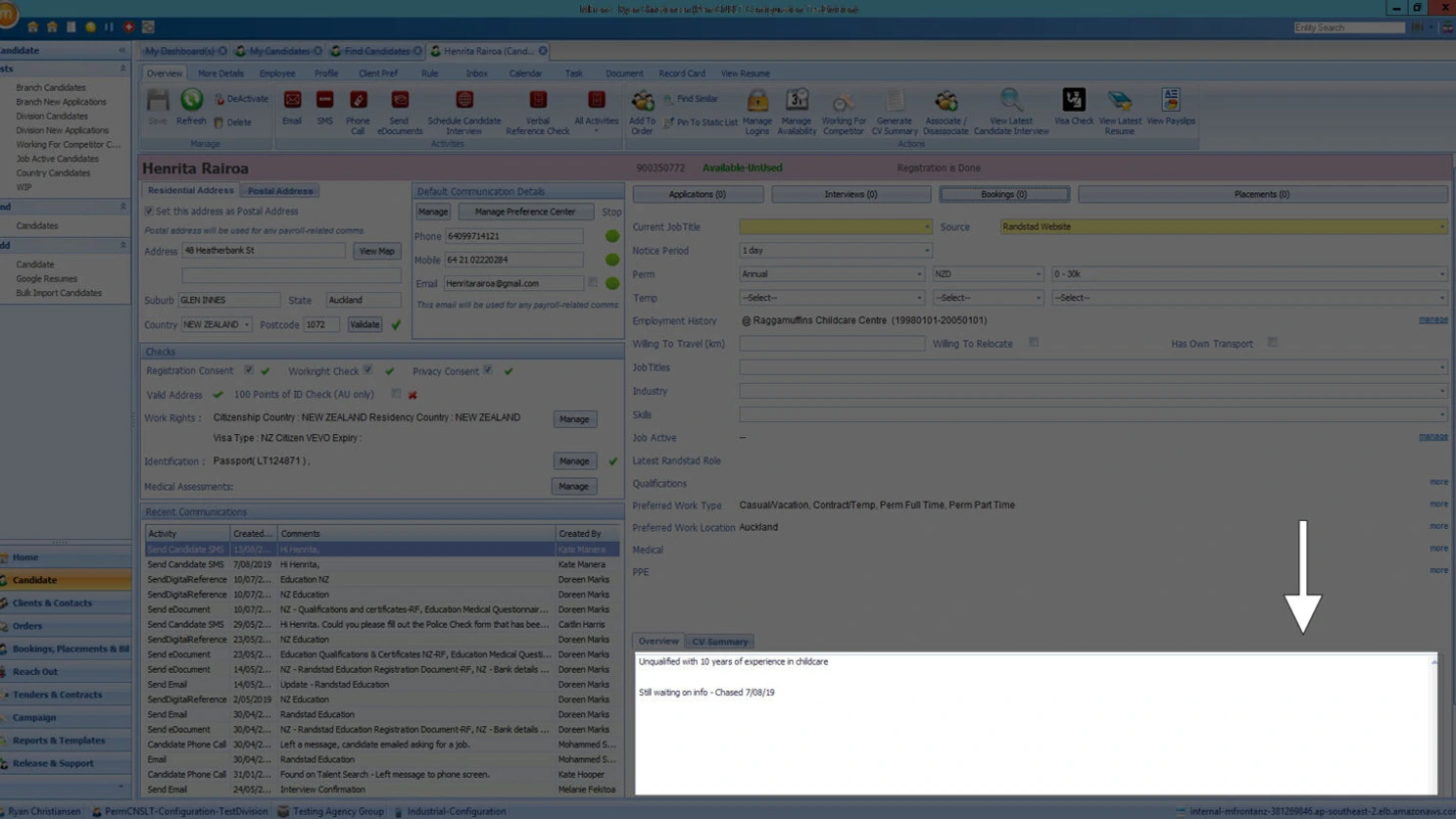
Before — buried below the fold, character-limited
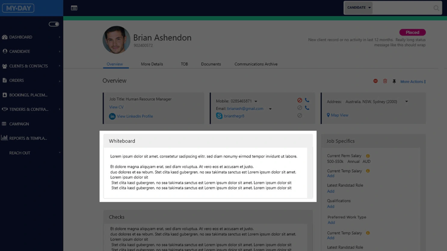
After — above the fold, expanded and unrestricted
UX Focus 03 — Responsive Application
The existing application was Windows-only and couldn't be accessed outside of a desktop. Every screen was redesigned for desktop, tablet and mobile — so consultants working from a client site, on the road or between meetings are no longer tethered to a laptop to get work done.
The application designed across desktop, tablet and mobile — device-agnostic for the first time in its history.
Five roles.
Five different definitions of useful.
Five distinct user personas were identified — each interacting with the application differently, with different data access needs and different definitions of what "working efficiently" looked like. Roles and permissions were mapped to each persona to ensure sensitive candidate data was only accessible to those who needed it. A Marketing Manager, for example, sees a stripped-back view with no access to candidate profiles.
Tracy Cavendish
Recruitment Consultant
Focus: Candidates & Clients
Overview
The most common user. Heavily uses the app for candidate placements, bookings, client visits and mapping. Multitasker — busiest at the start of the week.
Key Activities
- Candidate placements & bookings
- Client visits & care calls
- Interviews — phone and in-person
- Manage CV and candidate profiles
- Verify compliance docs & WHS
Pain Points
- Too much manual work
- Too many steps for simple tasks
- Slow, not user-friendly, data inaccuracy
Expectations
Better UI, improved data accuracy, fewer clicks, mobile responsive, automation.
Tech Skills
SavvyJames Hill
Branch Manager
Focus: Management
Overview
Direct oversight of consultants across the branch — onboarding, placements, client relations, team coaching and workforce management.
Key Activities
- Supervise and mentor recruiting team
- Review data quality & market maps
- Manage active bookings via Cognos
- Close positions and track targets
Pain Points
- Time-consuming manual work
- System slow and clunky
- Onboarding consultants takes 5–6 months
Expectations
Better reporting UI, easier activity logging, less clicks to close positions, quality data.
Tech Skills
IntermediateMona Singh
Sales & BD Manager
Focus: Client acquisition
Overview
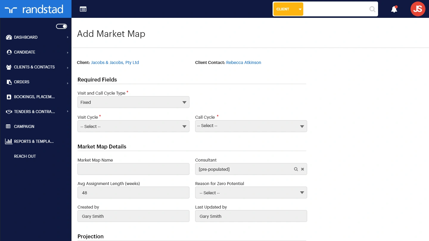
National role focused on new client acquisition and account uplift. Frequently travelling; uses market maps and dashboards to drive BD strategy.
Key Activities
- Log market map opportunities for clients
- Analyse account revenue trends
- Generate management reports
- Client calls and site visits
Pain Points
- Messy data with duplicates
- Consultants don't keep market maps current
- Account info not accurate
Expectations
Tool tips on client status, better UI, revenue decline alerts.
Tech Skills
SavvyKaren Atkins
Director / GM
Focus: Reporting & Reviewing
Overview
Uses the app daily as the "source of truth" for Randstad's business across regional and divisional branches. Busy at month-end for invoice approval.
Key Activities
- Generate reports & review business health
- Approve invoices
- Client connections and health checks
Pain Points
- Too many ways to perform the same task
- Clunky with too much detail
- Slow in the Citrix environment
Expectations
Better UI, easy invoice input, simplified tasks.
Tech Skills
IntermediateSharon Fields
Marketing Manager
Focus: Reference data only
Overview
Passive user — accesses aggregate data for automated campaigns and reporting. Restricted to a reduced navigation set to protect candidate privacy.
Key Activities
- Pull data for automated marketing campaigns
- Gather contact lists for email outreach
- Access general mFront aggregate data
Pain Points
- Not intuitive; interface feels like a database
- Unclear what data she's allowed to access
Permissions
No access to individual candidate profiles or privileged data — limited navigation by design.
Tech Skills
IntermediateMap the journey
before you build it.
User flows were mapped before any screen design began — identifying logic gaps, development requirements and permission boundaries across all five personas. The Consultant persona was the primary focus, representing the most frequent and complex usage pattern within the application.
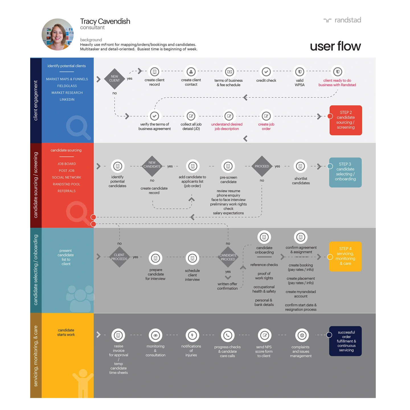
The Consultant user flow — the most commonly travelled path through the application, mapped end-to-end before a single screen was designed.
50+ screens.
Every flow accounted for.
Over 50 high-fidelity screens were designed and prototyped to cover the full MVP scope defined during workshops. User testing and validation were handed back to the client due to budget constraints — but every screen was built with enough fidelity to hand directly to development without interpretation.
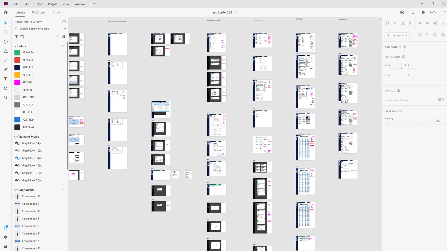
All 50+ screens laid out in Figma — desktop and mobile views across each persona, covering candidate profiles, search, whiteboard, bookings and reporting.
Finally, an app
worth logging into.
The application launched as a fully responsive, cloud-based platform — accessible on any device, free of the feature bloat that had accumulated over years, with an interface that respects the time of the people using it. Tabbed form navigation, a redesigned candidate profile and a global search that actually works. Recruiters can now do their job from wherever the job takes them.