No name. No brand.
Just a brilliant idea.
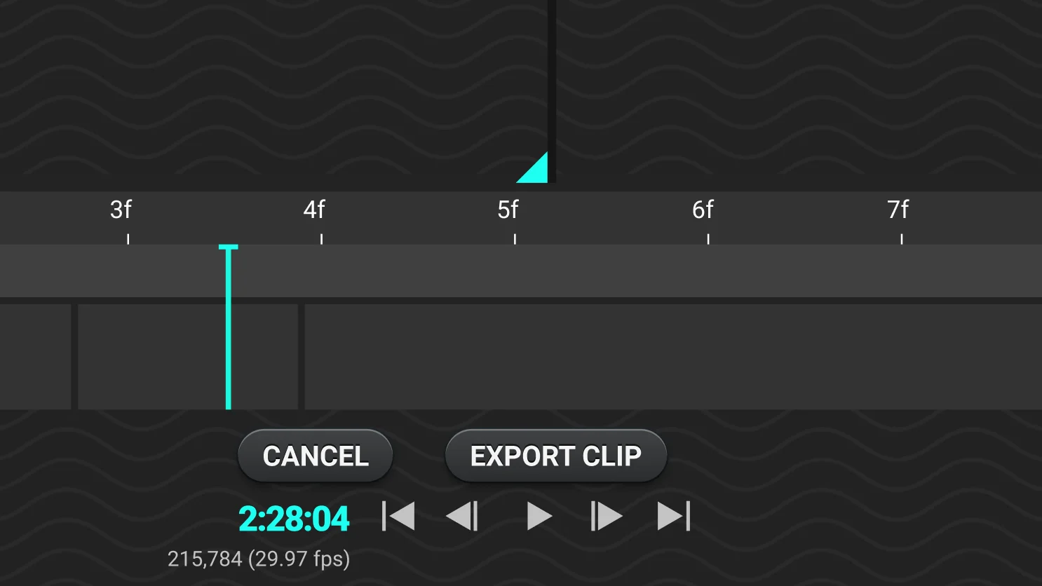
Surf Life Saving competitions have a problem every judge knows too well — when competitors cross the finish line within fractions of a second of each other, there's no objective way to determine the order. Disputes between judges, athletes and spectators are common, stressful, and ultimately unsatisfying for everyone involved.
An independent client who had competed and judged at events for years came to me with the concept: two cameras, two angles, one application that records both streams simultaneously and lets judges play back the footage instantly to make a definitive call. The project had no name, no brand and no visual direction — just the idea. My job was to take it from zero to an investor-ready prototype, including naming the application and designing its identity from scratch.
Pinpointing exactly
what needed to be built.
A discovery workshop with the client established the full scope of requirements — feature prioritisation, the competitive landscape and the personas who would be using the application. Because the goal was an investor pitch prototype rather than a production build, keeping the scope disciplined was essential: every feature had to earn its place in the MVP.
MoSCoW prioritisation gave us a clear, shared definition of the minimum viable product before any design work began — ensuring the prototype demonstrated the core concept compellingly without scope creep diluting the pitch.
MoSCoW Prioritisation
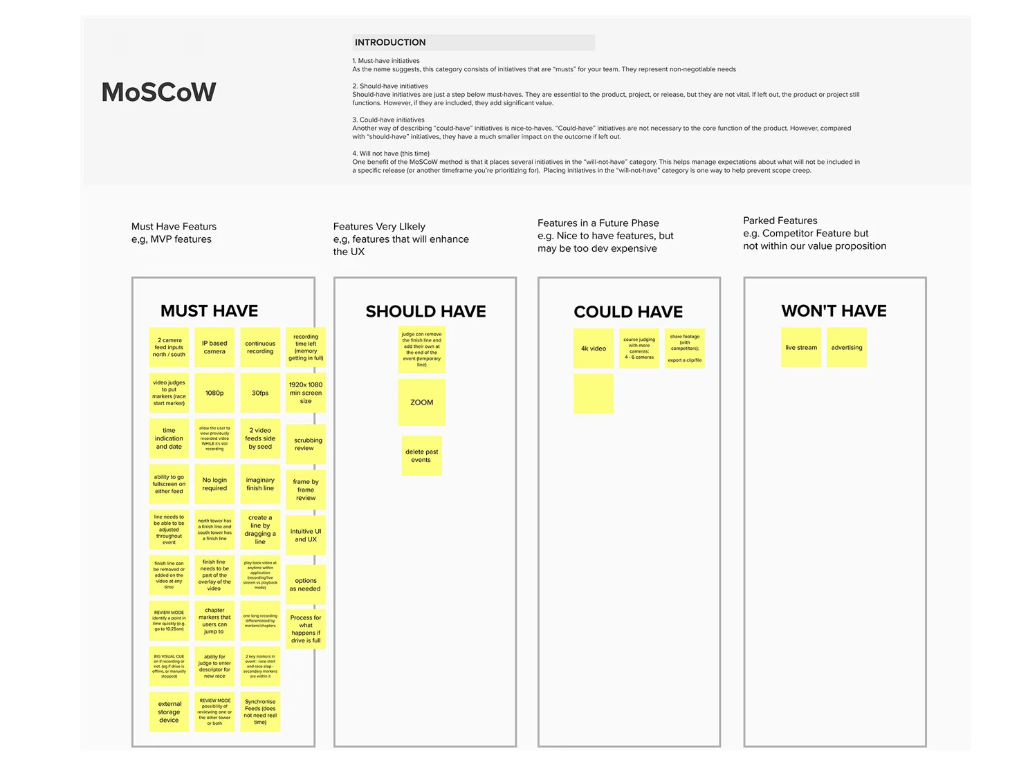
Feature requirements mapped against Must Have, Should Have, Could Have and Won't Have — scoping the investor prototype to its most compelling and essential functionality.
One user.
Designed with precision for it.
Rippl is one of the rare projects where a single persona defines the entire product. There are no different user groups, no permission tiers, no admin versus end-user split. The application is built exclusively for competition judges — and that singular focus is actually a design advantage. Every decision, every interaction, every piece of UI could be optimised entirely around one well-understood set of needs.
Daryl Kennedy
Competition Judge
Male · 42 · Sydney
"I used to compete in surf life saving events when I was younger. I still like to stay connected to the sport and to the people. Being a judge allows me to offer my experience to the sport."
Motivations
- Stay connected to the sport after competing
- Enjoy the excitement and adrenalin — even as a spectator
- The social aspect and meeting skilled athletes
Frustrations
- High pressure to accurately assess finish line order
- Confrontations with athletes and fans over unclear outcomes
- Stress from the expectations placed on judges for precision
Technology
- Competent
- Laptop & Apple Phone
How We Help
- Precise measurement of athlete finish positions
- Two-angle playback to resolve any ambiguity instantly
- Remove subjectivity — and the stress — from close calls
From concept
to Rippl.
The application had no name when the project started. After workshopping options with the client, I proposed the codename Rippl — a nod to the water, the sport, and the ripple effect of a definitive result spreading out from the finish line. The client loved it immediately.
The logo was designed to feel fluid and organic — reflecting the movement of water rather than anything rigid or corporate. The colour palette draws from the turquoise greens of ocean water, keeping the identity closely tied to the environment it lives in.
Both name and brand were treated as a working codename pending a full trademark and competitive analysis — giving the client something compelling to pitch with, while protecting the flexibility to pivot if needed.
Every screen.
Every state. Investor-ready.
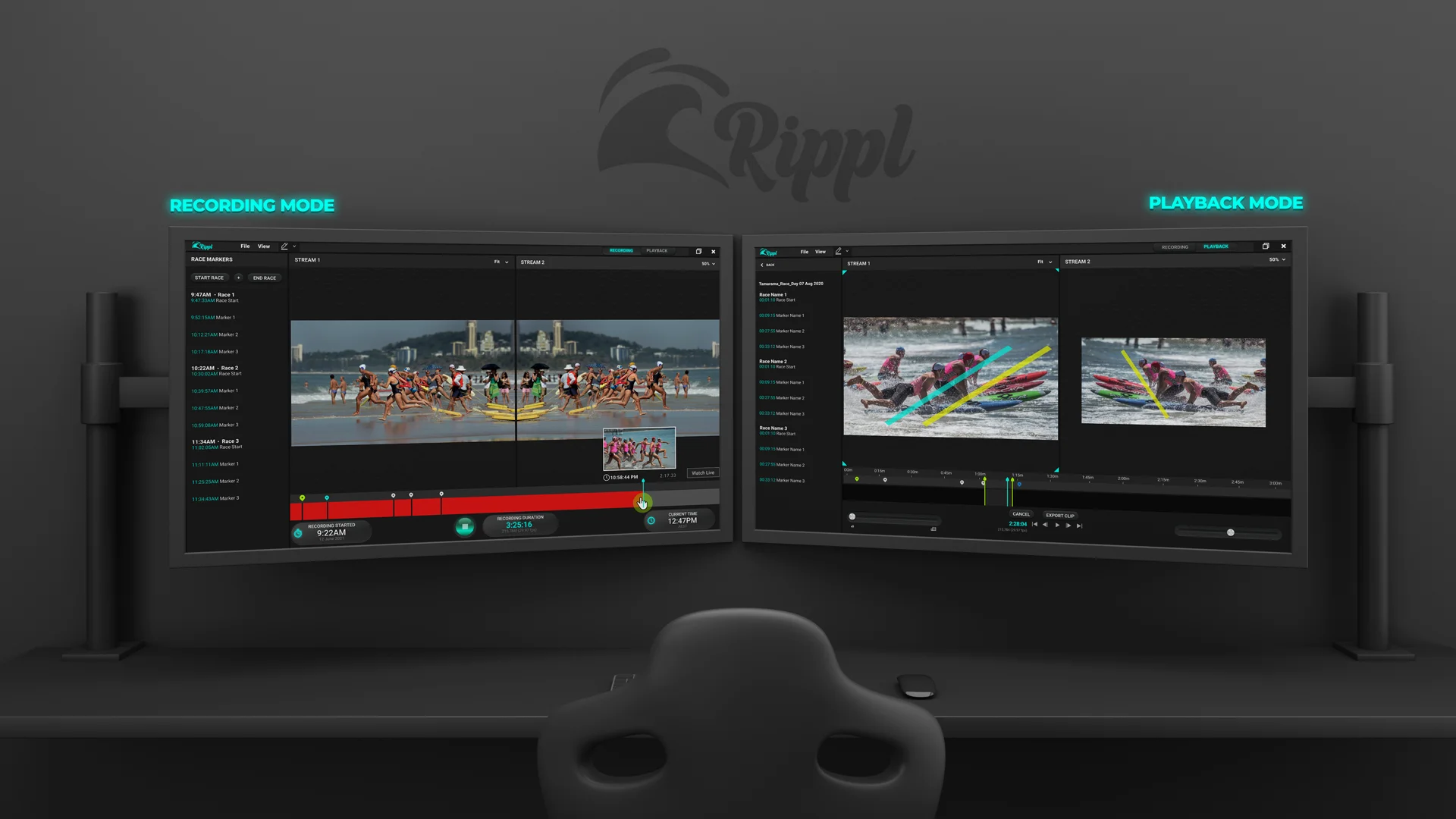
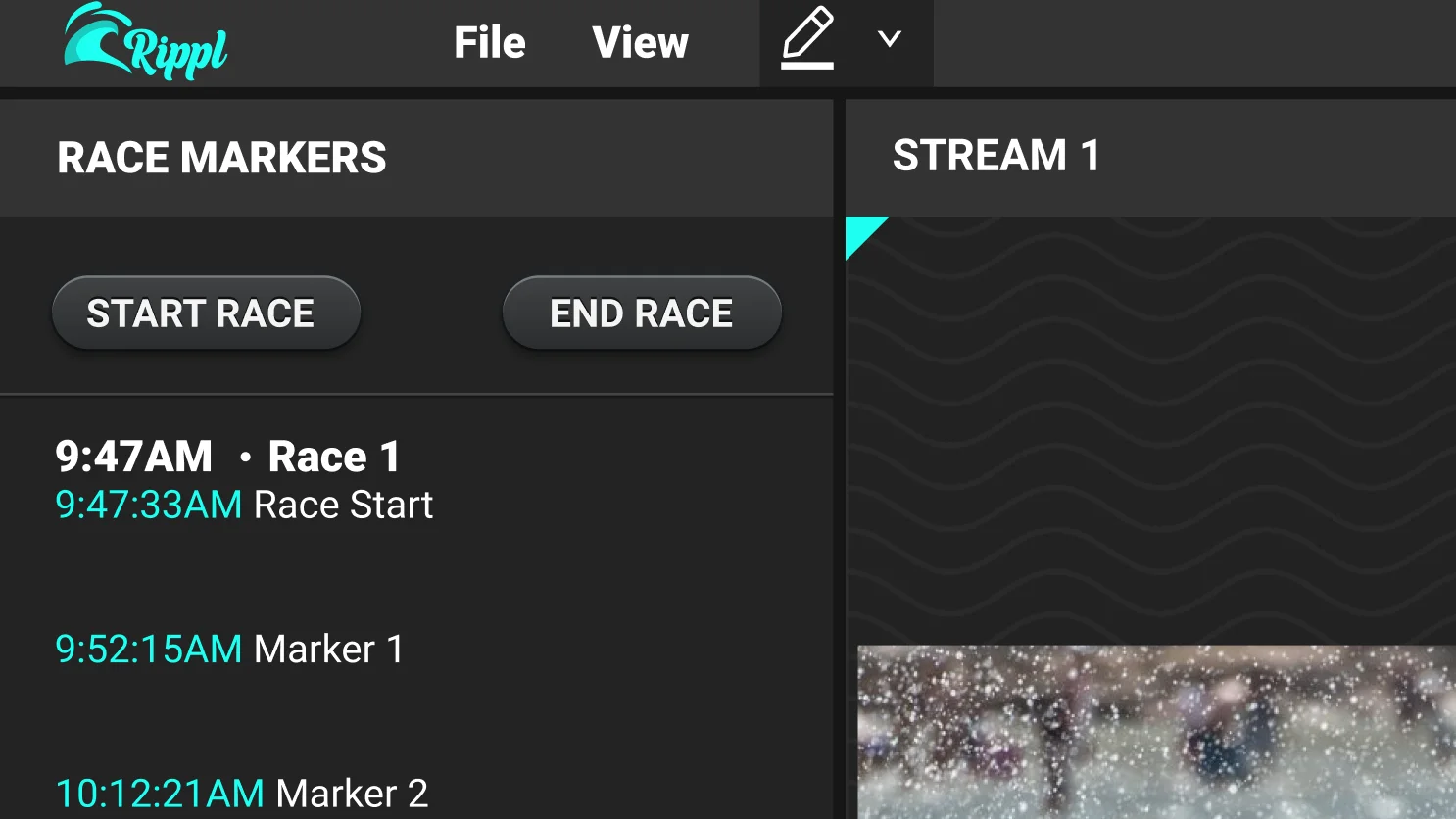
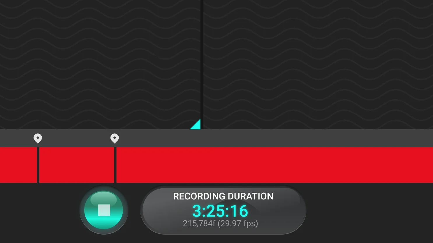
All screens, flows, empty states and error states were designed in Figma and wired into a fully interactive prototype — detailed enough to be taken directly to investors as a demonstration of the product vision, and precise enough to hand to developers when funding is secured.
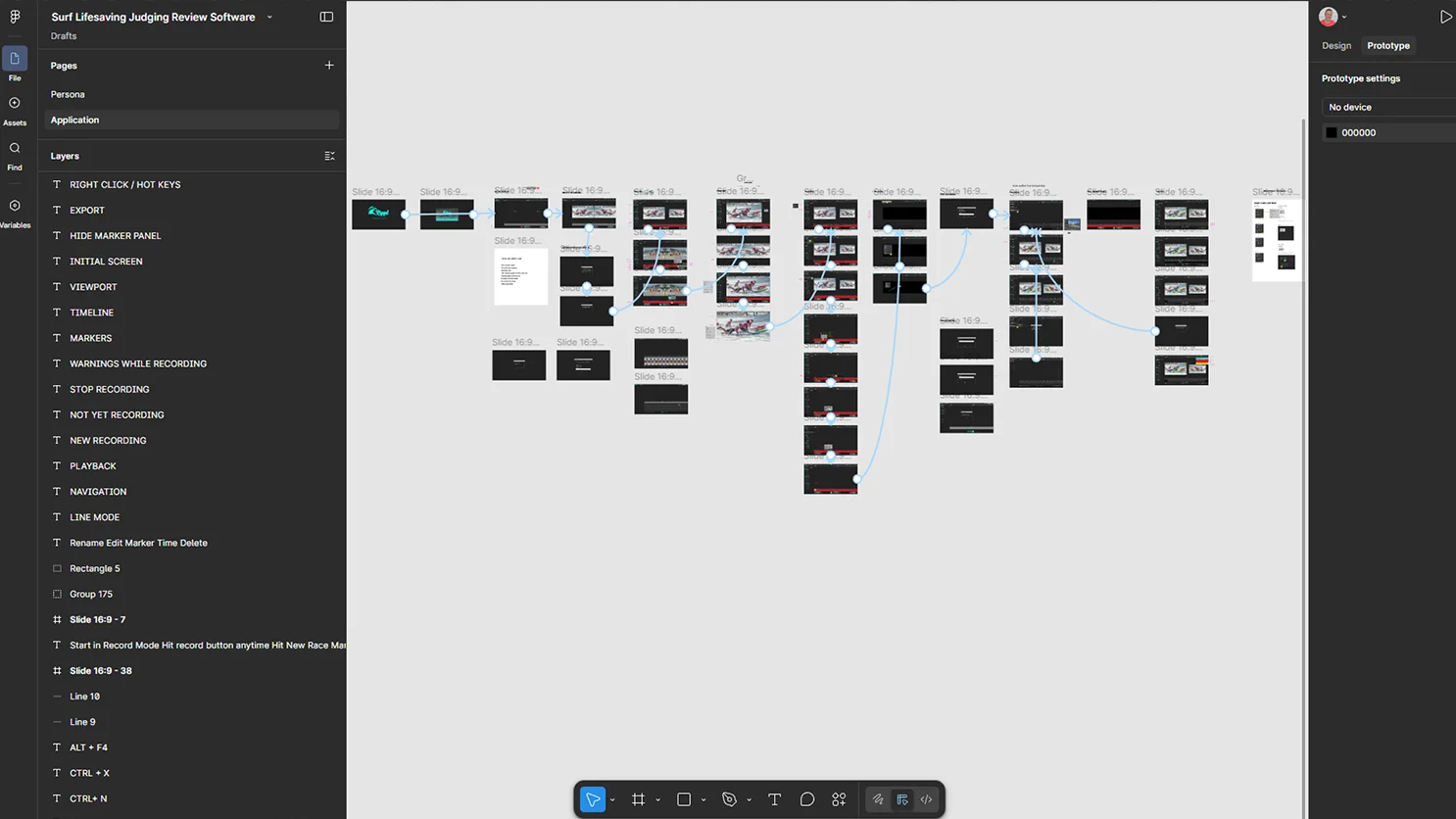
Full Figma prototype — all screens, flows and states documented and annotated for both investor presentation and future developer handoff.
The case for
neumorphism.
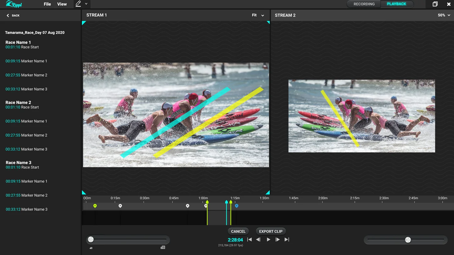
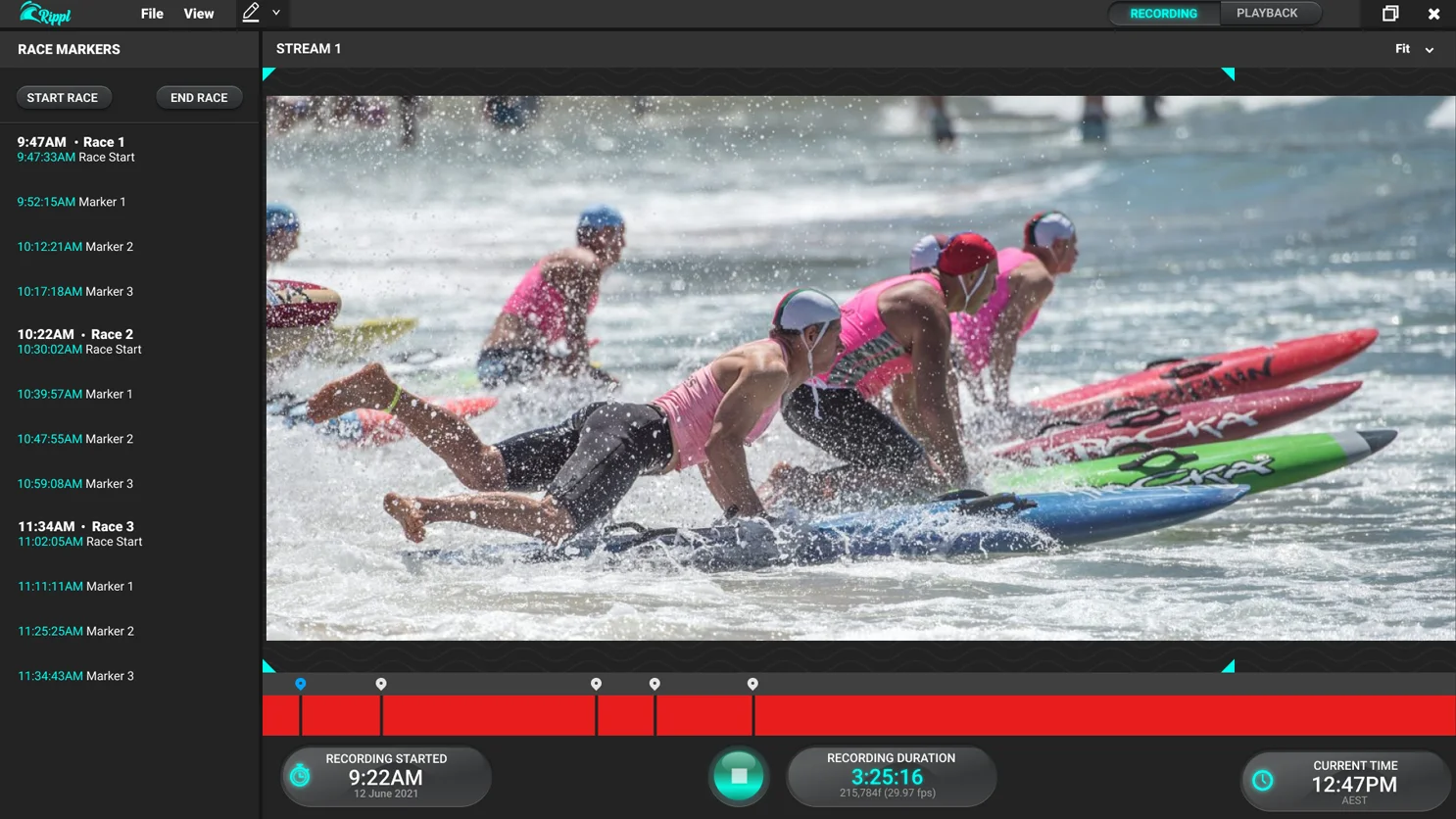
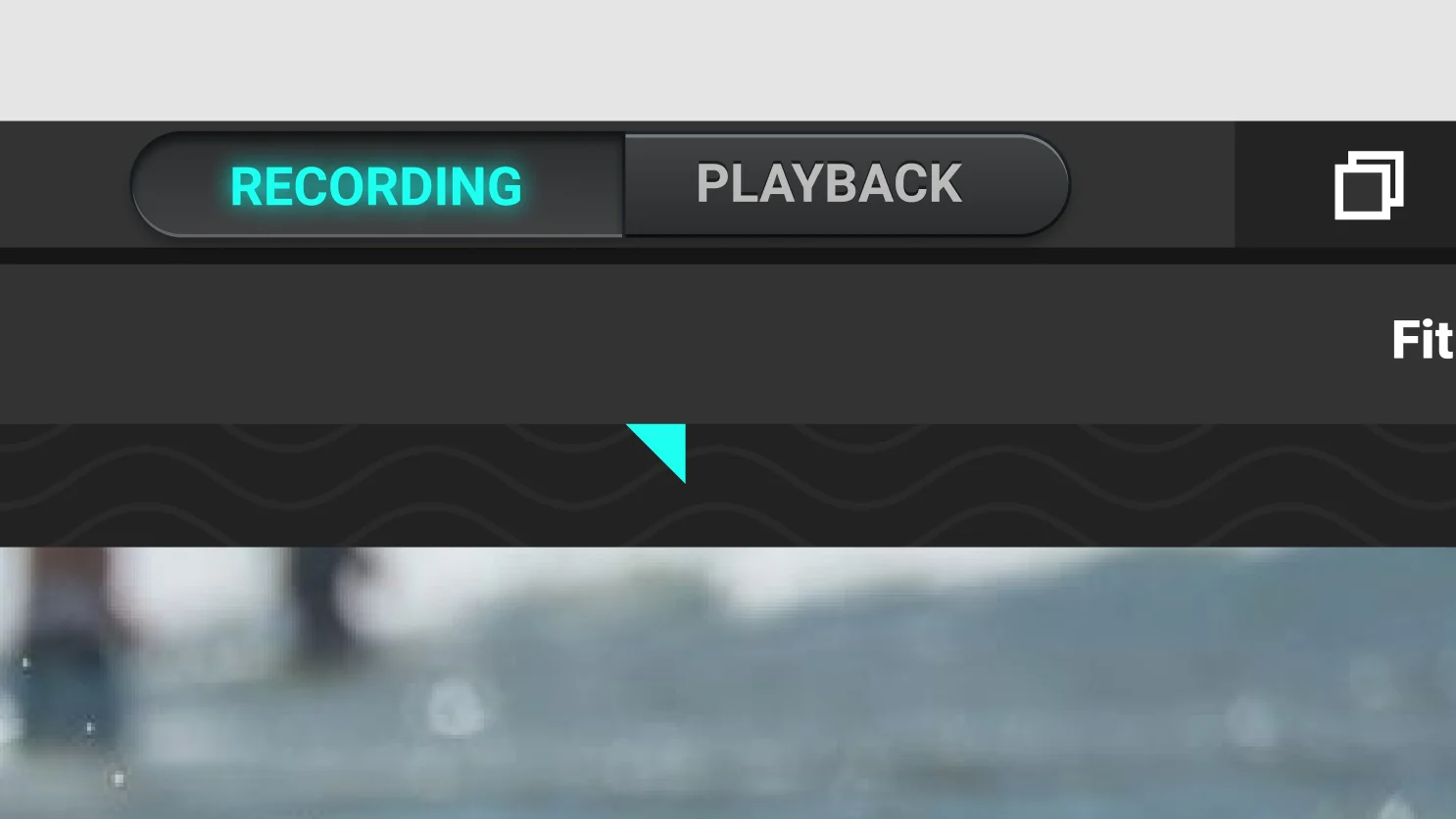
Neumorphism is a design style that creates the illusion of depth and physical substance — controls and buttons appear to be pressed into or extruded from the surface, giving the interface a tactile, almost three-dimensional quality. Think less flat button, more actual button.
For Rippl, it was the right call. The application is functionally closer to a video production tool than a standard web app — two live streams, precision playback controls, frame-by-frame scrubbing. A neumorphic UI gives the interface the weight and physicality that context demands, and makes the controls feel deliberate and satisfying to interact with. It also happens to look exceptional on a large monitor, which is exactly where judges will be using it.
From whiteboard
to pitch-ready.
A fully annotated interactive prototype — complete with name, brand identity, and a neumorphic interface that looks unlike anything else in the field. The client walked away with something they could put in front of investors and be proud of.