


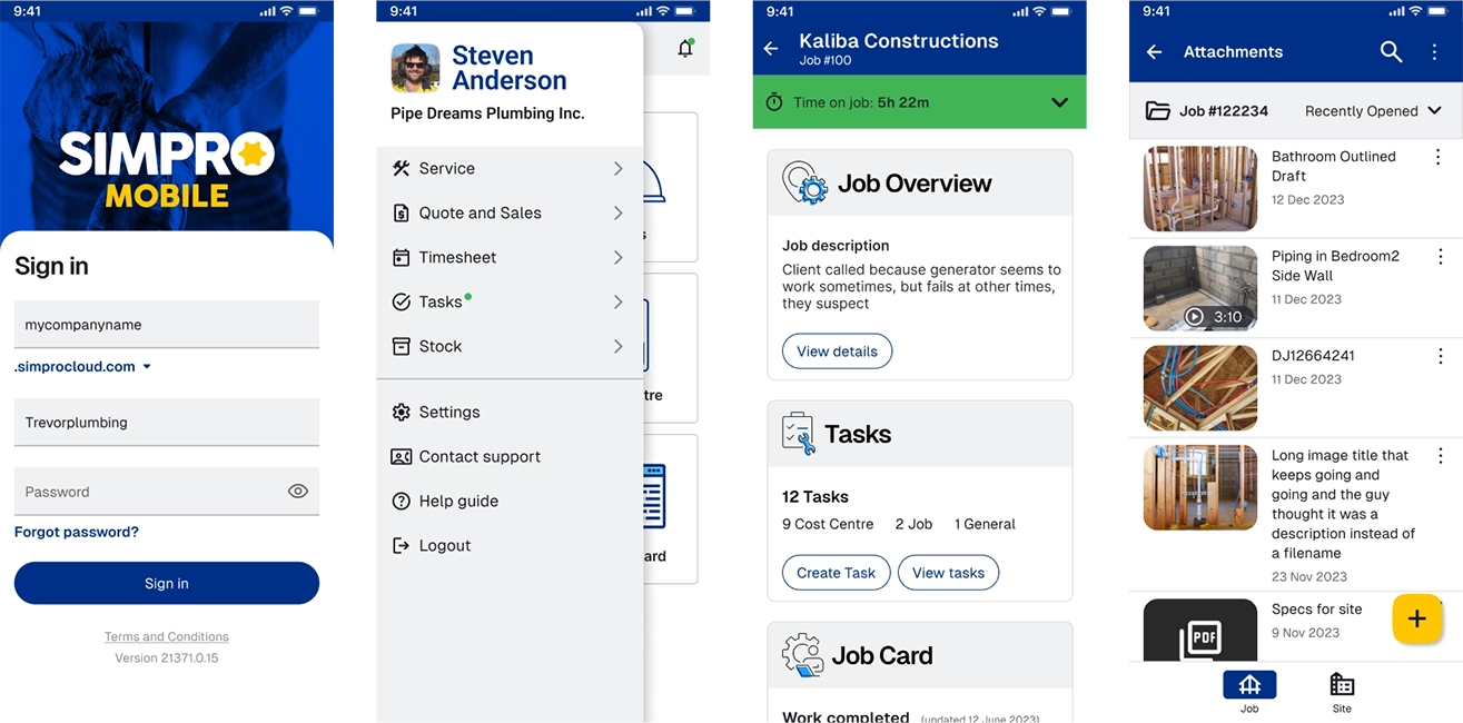
Simpro mobile application
Context
Simpro Mobile allows field technicians and trades people to simplify job management in the field. Field staff can access assigned jobs, site history, customer details, job notes and other information needed to complete a job.
The application user ratings were some of the lowest in the industry. I was assigned to the Simpro Mobile team and was tasked to overhaul the UI and UX of the application to offer users a more intuitive and delightful experience, along with a more modern interface. I crafted a new design system called “Forge” and conducted numerous customer interviews to design the new modules that were informed directly by user feedback. There was a great deal of research that went into the new design.
- Dated user interface lacking UI consistency
- Complex user experience with overly complicated flows
- Complicated and slow to use
- Non-responsive application
- Streamlined the user flows informed by user feedback
- Modularised content vs overcrowding screens and information overload
- Modern UI catering to our specific personas bolstering competitiveness
Drag the middle slider to see before and after

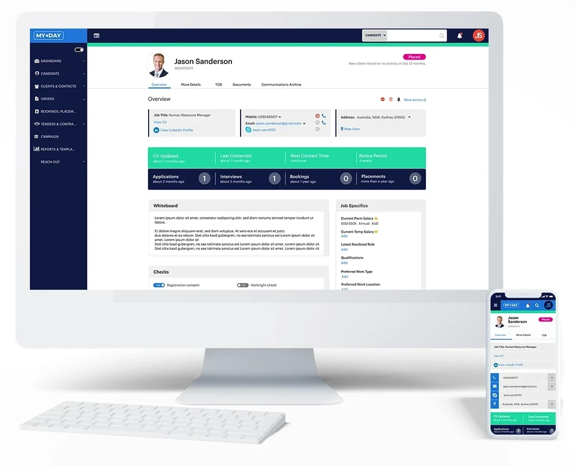
Randstad recruitment application
Context
Randstad is a Dutch multinational human resource consulting firm. Their current software-based recruitment application used by consultants globally was in need of a re-brand and updated technology. Specificailly, randstad was looking to develop a responsive web-based application that offered the core features of the current application, but with improved usability and interface and trimmed down features.
- Non-responsive application
- Scope creep over the years with an overload of unnecessary features
- Complicated and slow to use
- Non-responsive application
- Fully responsive application
- Rebuilt with stripped back features for ease-of-use
- More intuitive to use with and updated interface
Drag the middle slider to see before and after

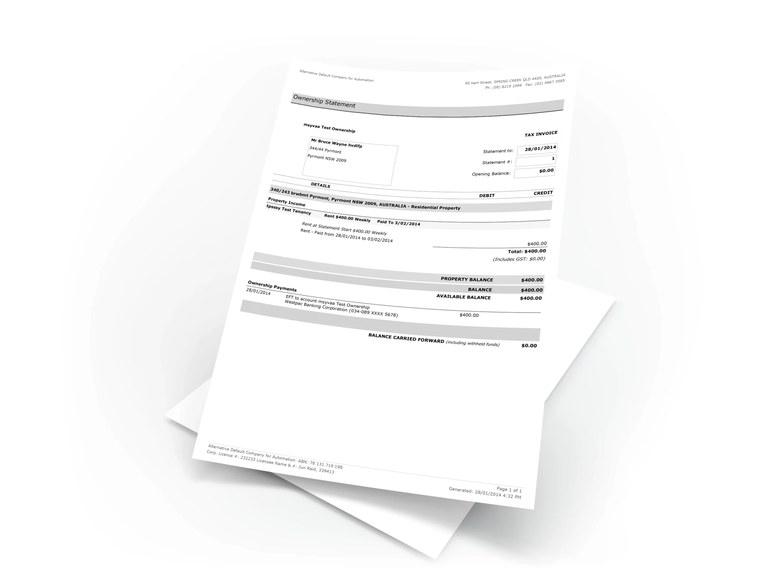
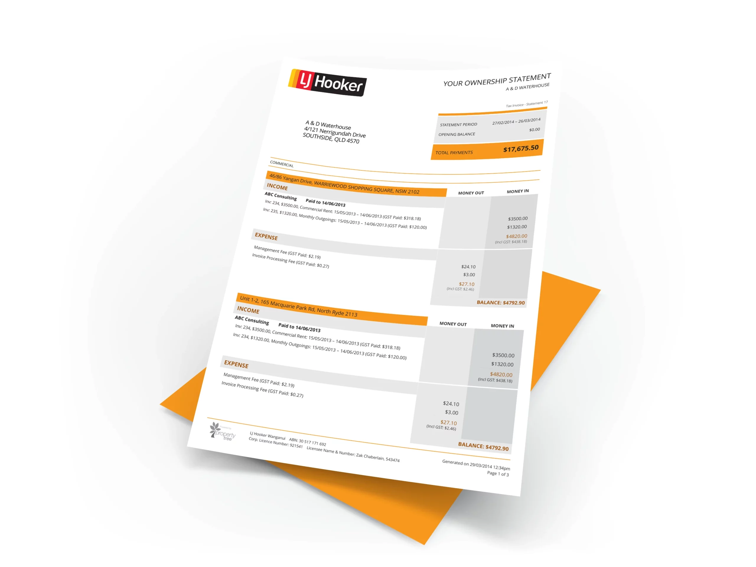
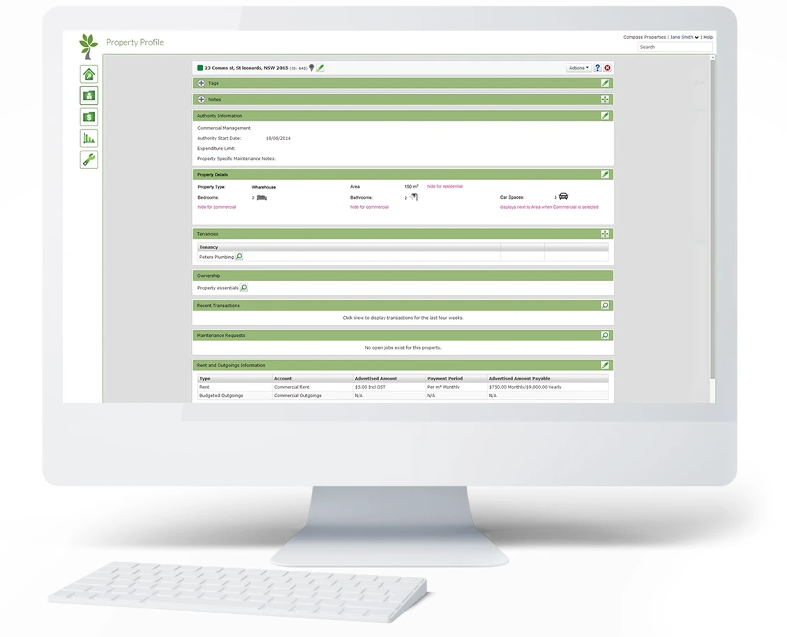
RealEstate Owner Statements
Context
PropertyTree, a cloud-based property management application, sends ownership statements to its users who are owners of either commercial or residential properties.
- Real Estate Agencies wanted the ability to style owners’ statements with their brand
- Owners were finding it difficult to understand their statements when they held multiple properties
- Commercial and residential properties needed to be better delineated
- Fully branded statements
- Statements with multiple properties are clearly outlined with "Money in" and "Money out" columns
- Commercial and residential properties are separated
Drag the middle slider to see before and after
The TaxInstitute
Context
The Tax Institute is used by approximately 11,000 members. There was no proper member portal that users could access to get their paid tax-related content, see their upcoming events, access books, journals, podcasts, etc.
- The site lacked a proper member portal where members could easily access their account information, paid content, and entitlements.
- All member content and account information was scattered throughout the application.
- Users were finding it difficult to understand where they needed to go to get access to their paid content and their account information.
- The previous user flows and journeys had been poorly considered.
- Complete member portal with all the users' content, upcoming events, account information, etc.
- Reduction of customer support contact as access to information was now easily available
- New user flows with a better hierarchy of information that consolidated similar areas
Drag the middle slider to see before and after


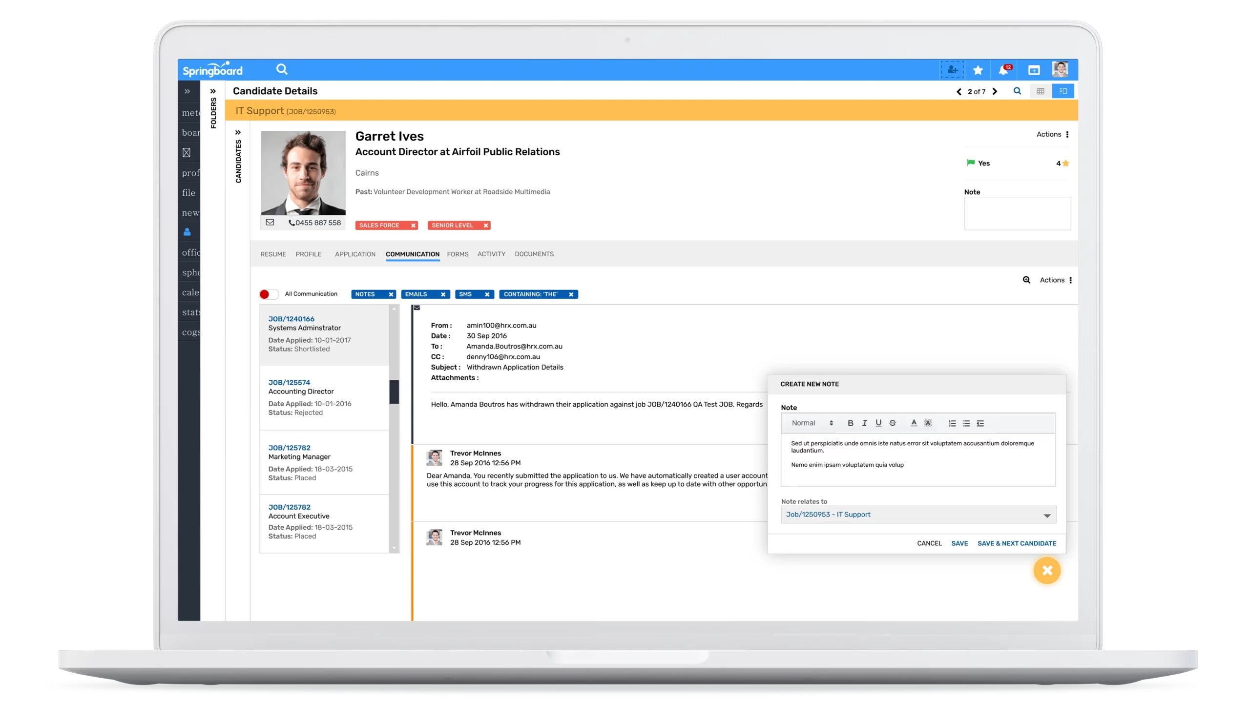
Springboard
Context
Springboard is a recruitment web application used by recruitment agencies globally. The application had grown in size over the last 10 years and the interface was dated and the user experience was complicated with too many unnecessary features that were added over the years.
- The user interface was dated and confusing. Design patterns were not used consistently, leaving users confused.
- The data was condensed so tightly on the page that there was information overload offering users no direction where to look or what to focus on.
- Workflows were compromised with too many clicks to accomplish tasks.
- The information architecture was poorly organised.
- All new user flows and journeys designed that streamlined workflows and reduced clicks and time-on-task
- More user friendly and modern interface with consistent design patterns
- Removed much of the functionality that was deemed no longer necessary by users
Drag the middle slider to see before and after

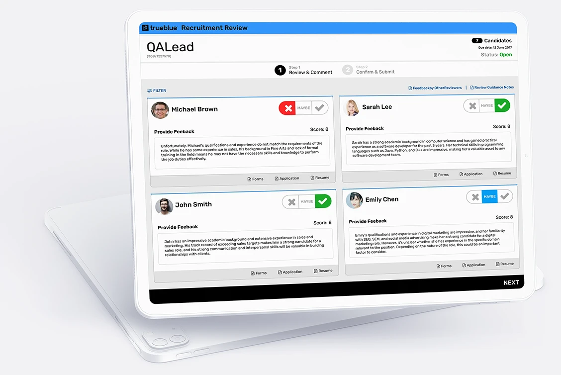
PeopleScout: Hiring Manager Feedback
Context
The Hiring Manager Feedback is a web-based recruitment review application used by hiring managers to quickly review and provide feedback on candidates for jobs.
- The application needed to be overhauled to onboard global top tier companies.
- Reviewing candidates involved a lot of scrolling and clicking/pressing.
- The application was not responsive and difficult to use on mobile devices.
- The interface had been designed by developers and did not present a professional brand.
- Fully responsive application so recruiters can review candidates anywhere, anytime
- Clear and modern interface making it simple to access information and vet candidates
- Simple, uncomplicated user flows
Drag the middle slider to see before and after

PropertyTree
Context
PropertyTree is Australia’s and New Zealand’s first cloud-based property management application. It is used by Australia’s leading Real Estate Agencies such as Ray White, Harcourts, LJ Hooker, First National, and others.
- The application had an overly complicated and dated interface.
- The landscape of competitors was beginning to grow and many offered an improved user experience.
- Features that were continually added over the years and were integrated in non-intuitive areas.
- Customer interviews and contextual field enquiries to create a new UX that matched exactly what users were expecting
- Complete overhaul of the interface to make it more modern and competitive
- Complete overhaul of the user experience adjusting the information hierarchy and user flows to make them seamless
Drag the middle slider to see before and after

TaxVine Newsletter
Context
TaxVine is an email newsletter and ranked as the second most important member feature at The Tax Institute. It is sent weekly and contains timely and highly relevant tax information for the some 11,000 members who pay for it.
- The email newsletter contained the entire content including member feedback on past emails sent out! Scrolling through this volume of content in one newsletter was burdensome to members.
- As a member-only paid entitlement, it was not behind any login wall, but freely available to share via email with anyone.
- The email was not mobile-friendly.
- Overhauled the interface to make it feel more premium
- Provided teaser articles that linked to the new member portal I designed, rather than provide each section with the entire full article
- Users could no longer share this paid service email with others since access to the full articles were behind the member portal
- Images were added to the newsletter to complement the articles rather than just a long email of text
Drag the middle slider to see before and after

