- Case Studies
-
-
Randstad
-
Recollo
-
Assemble Sports
-
-
-
Rippl
-
-
GCG Health Safety & Hygiene
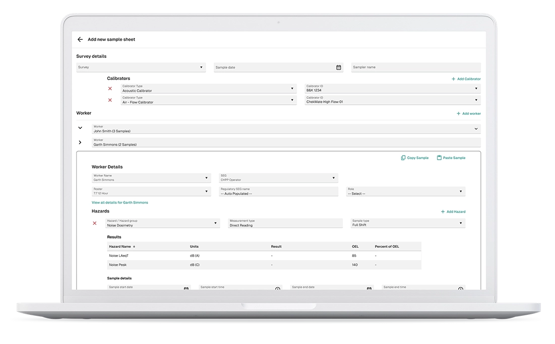
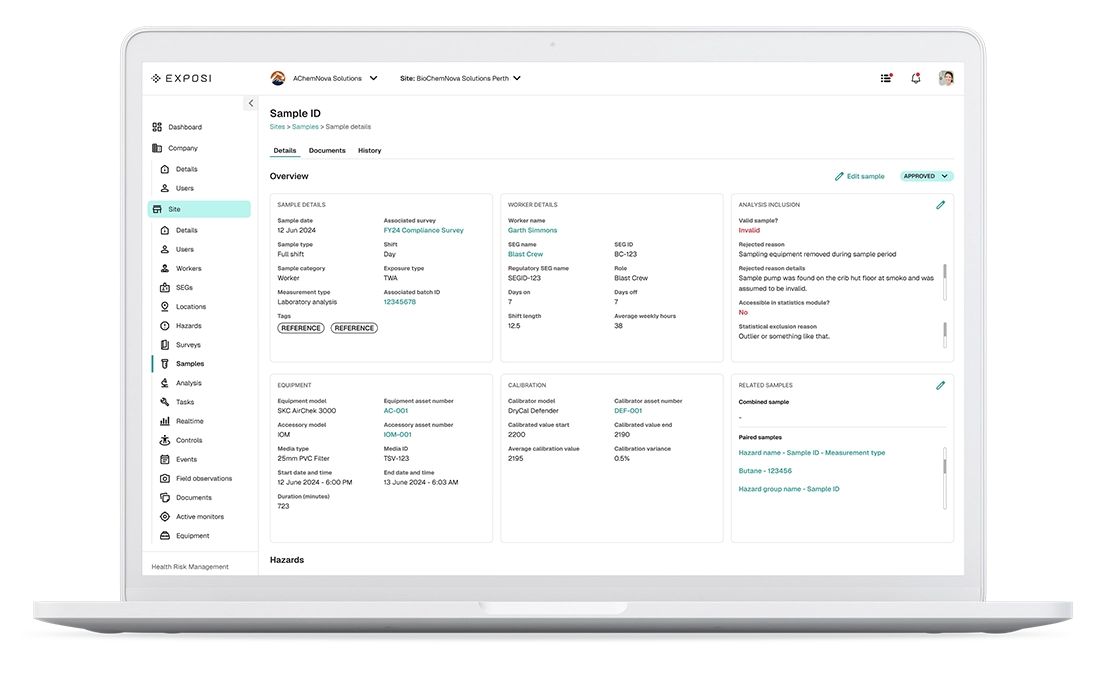
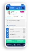
GCG Health Safety & Hygiene utilizes a structured web application for health professionals to input detailed information related to health testing. This system captures a comprehensive range of data, including participant demographics, test results, medical history, and specific workplace exposure details relevant to occupational health assessments.
I was exclusively hired to redesign the UI and UX of GCG’s Health & Safety application. My primary objective was to consolidate two existing applications into one comprehensive field application. This involved a thorough audit to remove unused features and enhance current ones, ultimately optimising both the UI and UX.
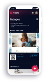
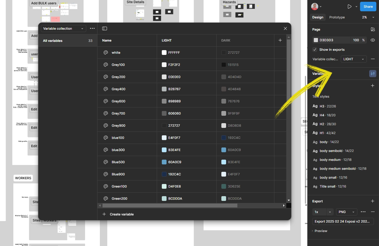
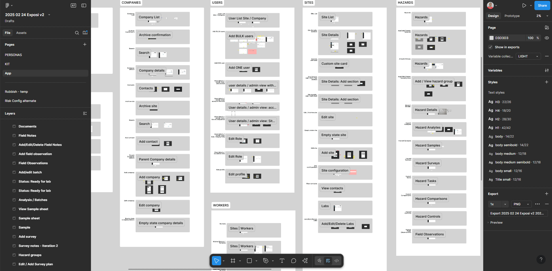
I rebuilt the application from the ground up, creating over 100 screens that seamlessly integrated the previous two application workflows into a single, cohesive experience. A key design feature was the implementation of variables in Figma, allowing for easy toggling between light and dark modes.
ClientGCG Health Safety & HygieneServicesUI, UXYear2025Linkwww.gcg.net.au
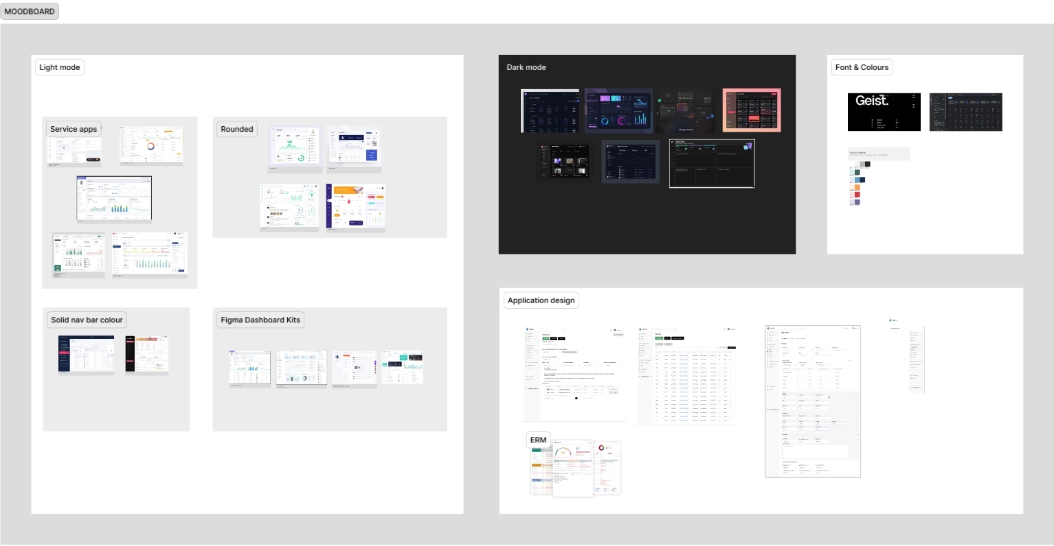
Mood Boards for UI Direction
To determine the UI direction, I collaborated with stakeholders who already had a preferred colour scheme and general layout in mind. My role was to present design ideas focusing on typography, iconography, and information hierarchy. This included proposing optimal navigation schemes, ensuring responsiveness, and refining the overall layout.
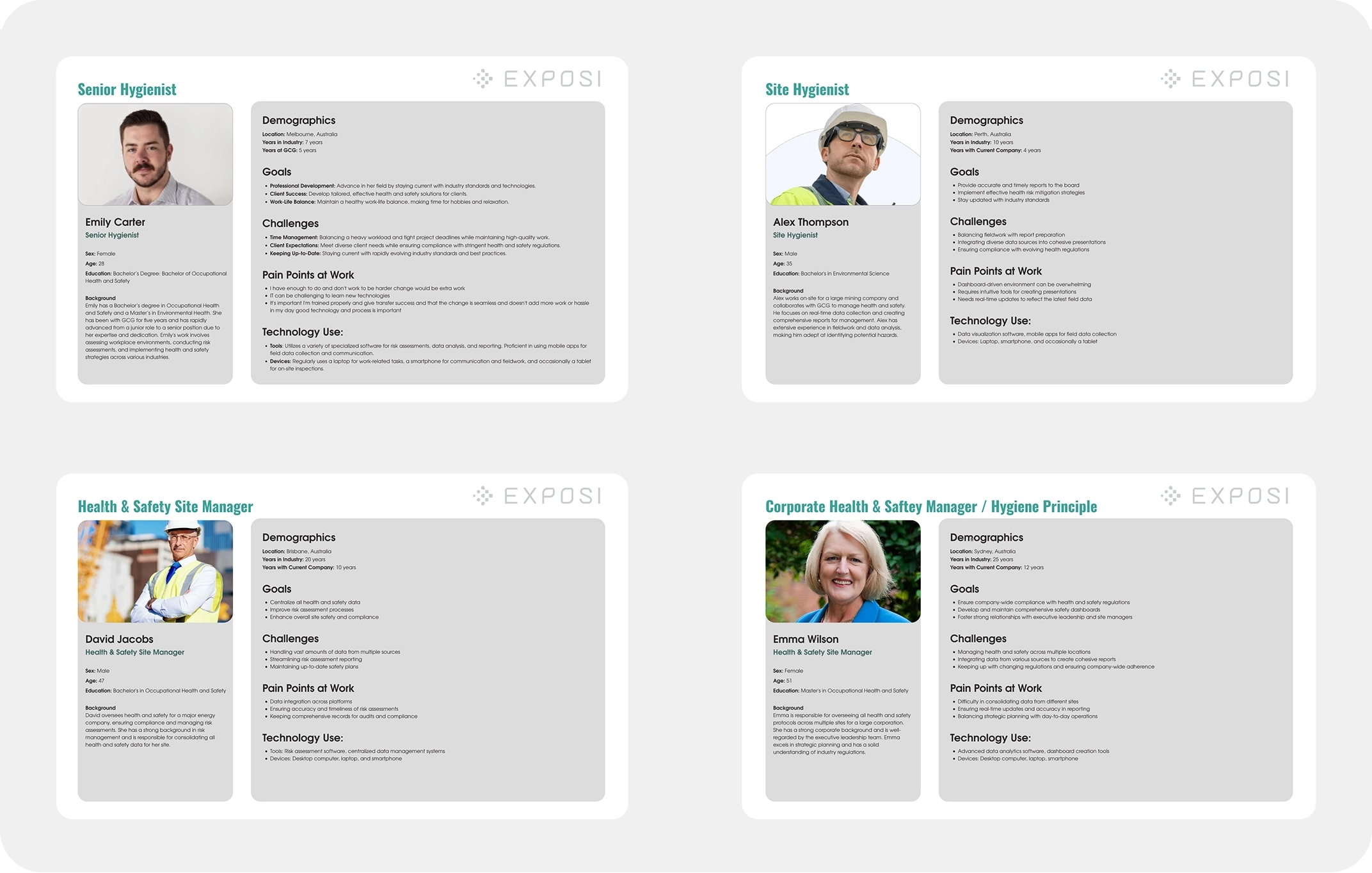
Persona design
Before commencing any design phase, it is fundamental to understand an application's primary users. Four distinct personas were identified for GCG, each utilising the application for slightly different purposes. Their unique roles and specific usability criteria were addressed through tailored security features and targeted user flows within the app.
Application design
Light / Dark mode
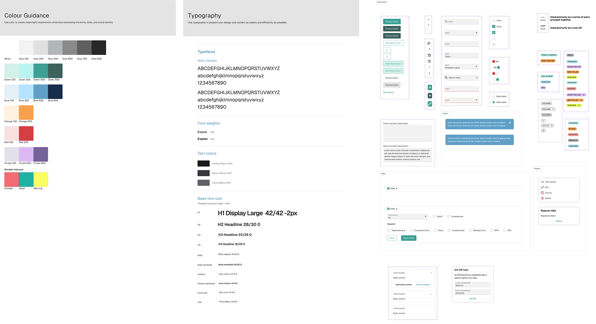
When determining the styles for the new application, I prioritised scalability, accessibility, aesthetics, and legibility. For typography, I selected Geist, a contemporary typeface similar to Figma's default (Inter) but with a slightly taller x-height and improved ligatures for enhanced readability. The primary colour scheme was a refreshing green, chosen to evoke health and well-being. All iconography was sourced from Material Design 3, Google's robust application icon set.
Just a flip of that switch, and every screen is transformed into dark mode - or any colour theme the client wants. This is the power of designing with tokens.
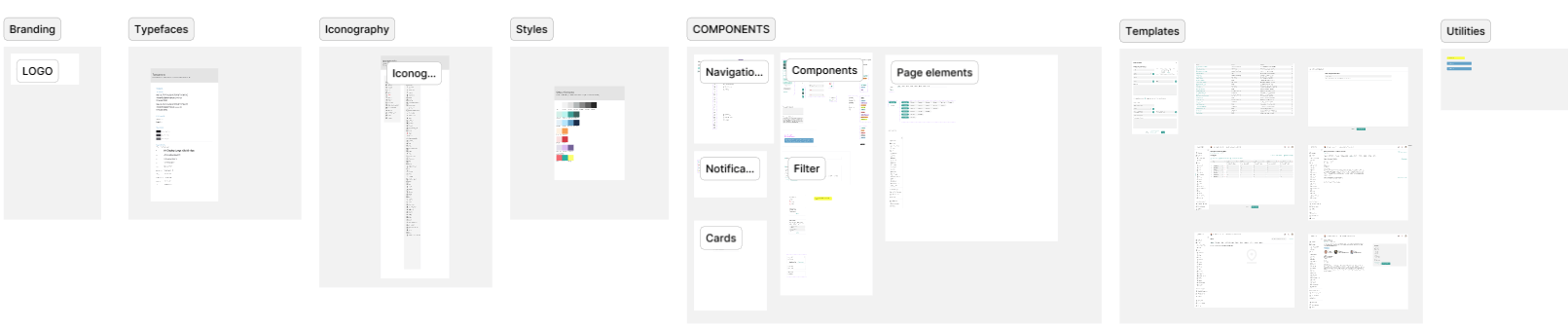
UI Kit
A comprehensive UI kit, complete with tokens, was developed to ensure consistency and efficiency across all designs. This centralised resource includes all components, styles, and guidelines, streamlining the design process and maintaining brand integrity.
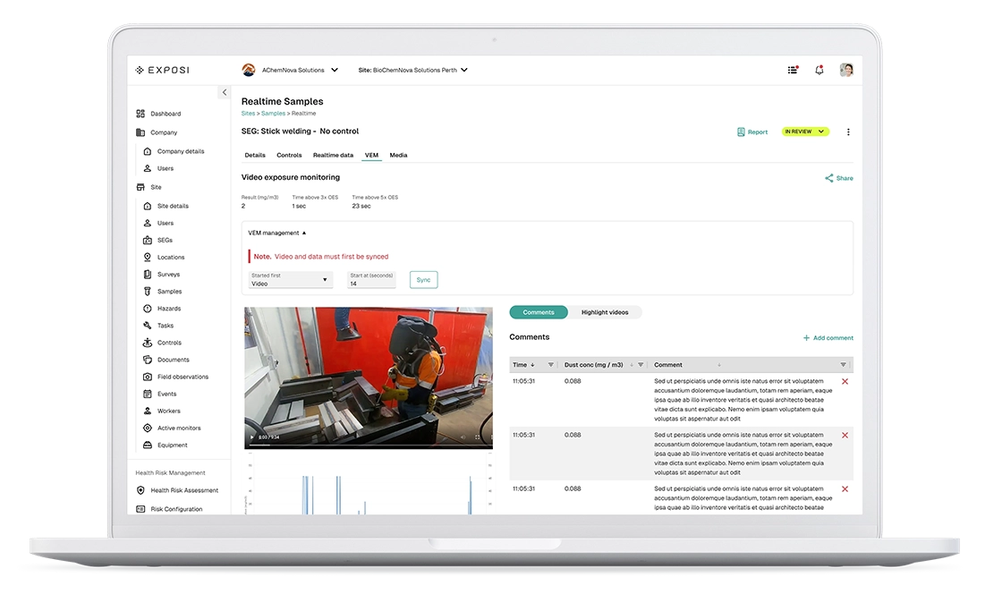
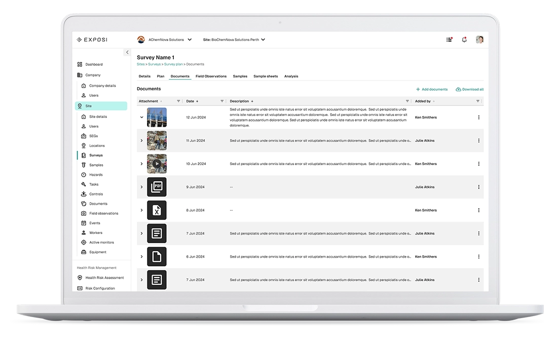
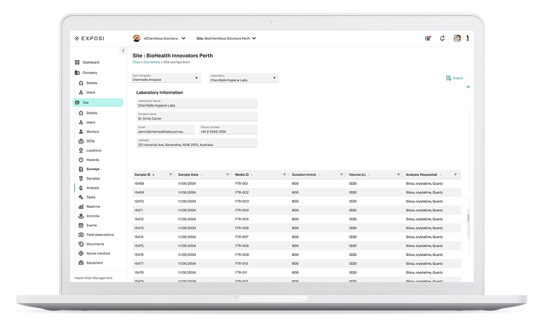
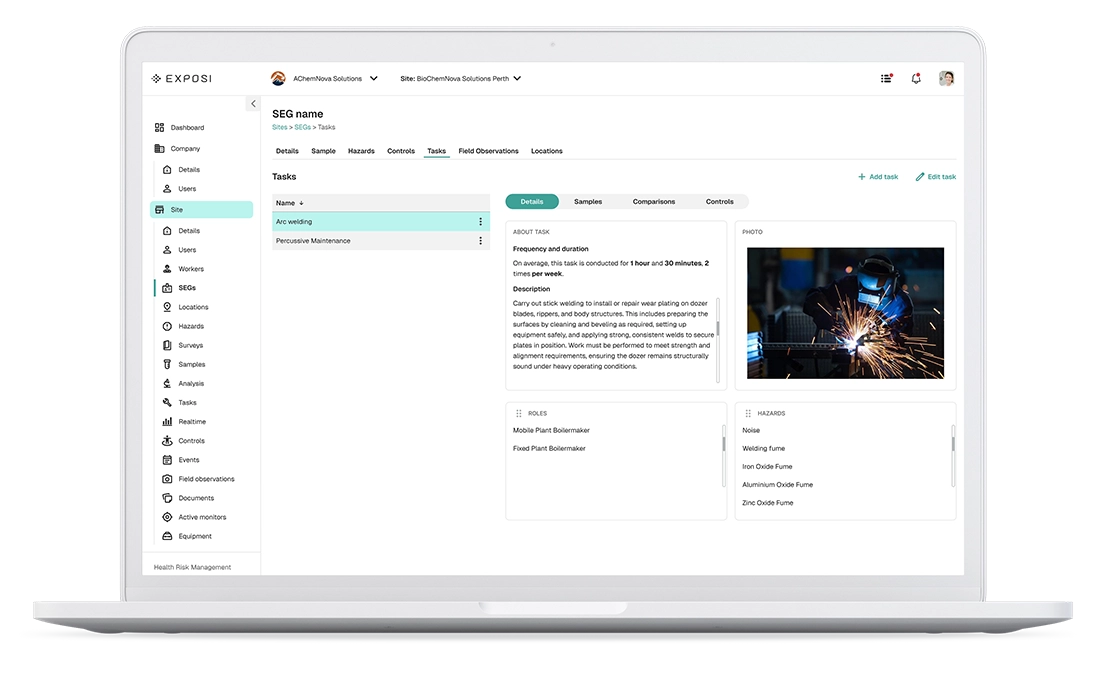
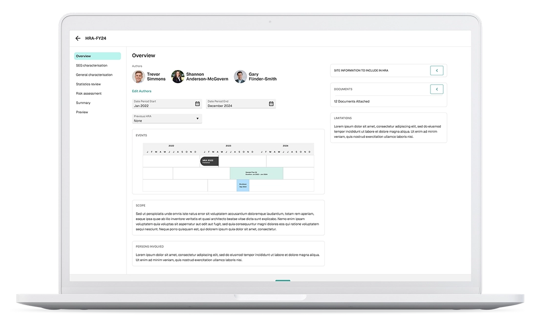
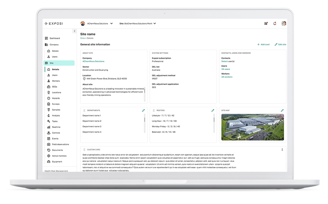
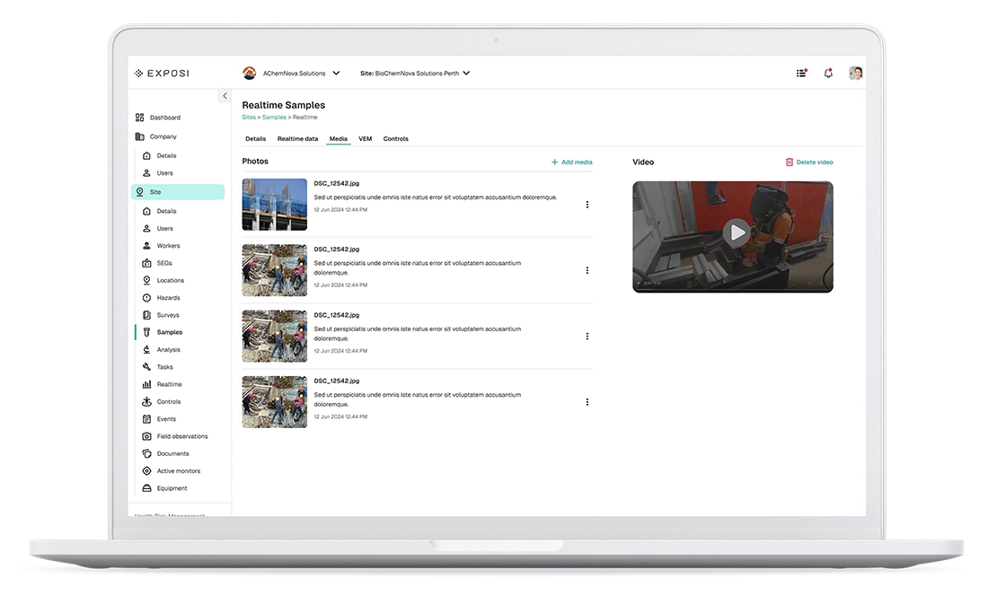
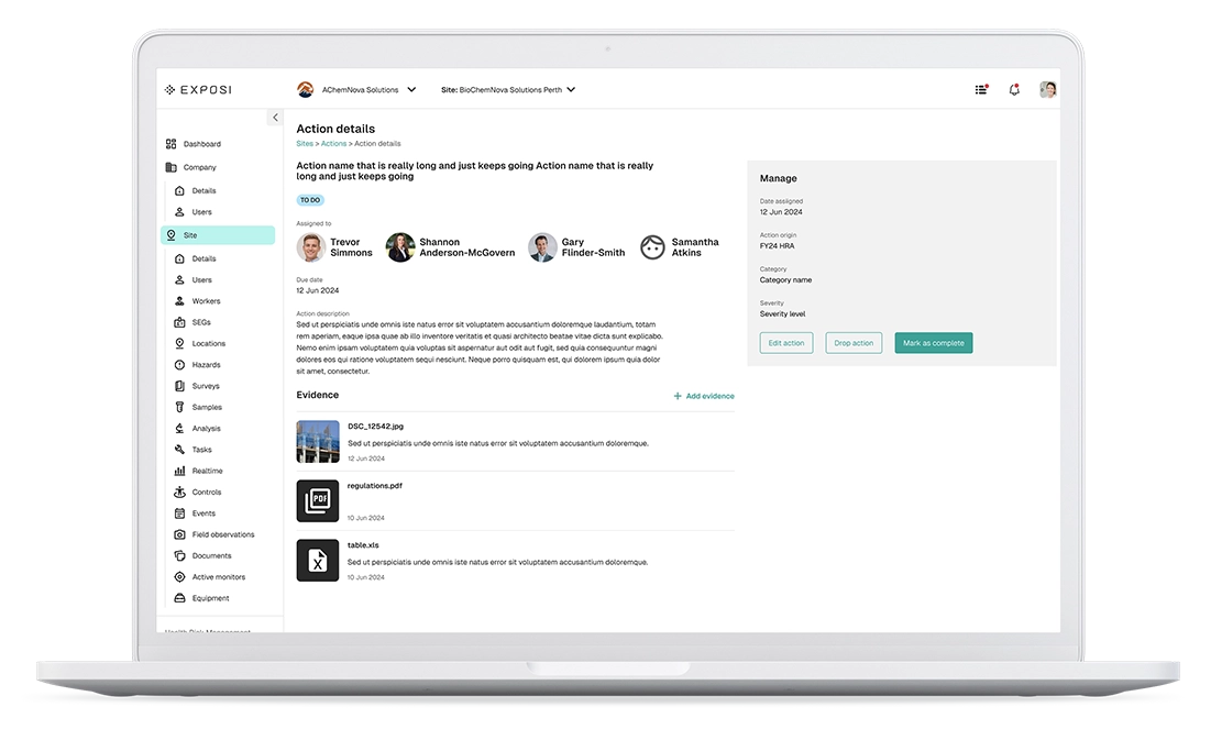
Application: Screens
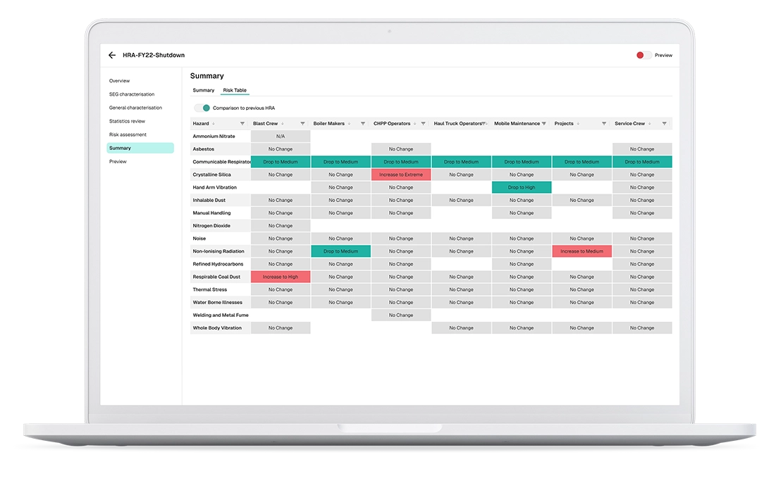
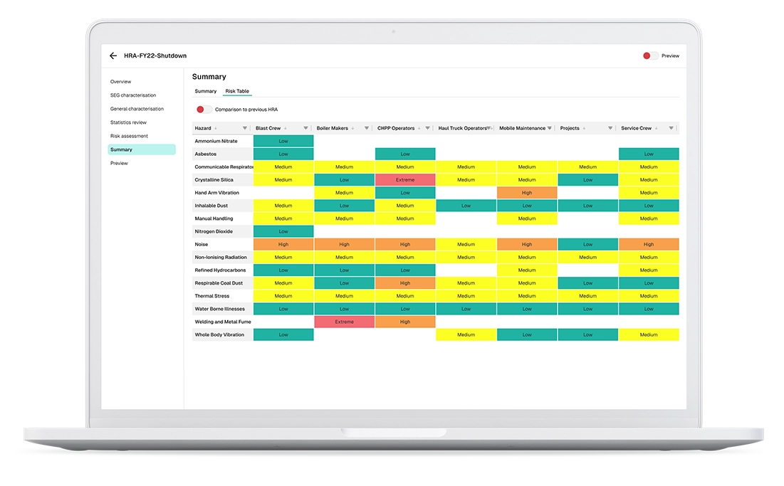
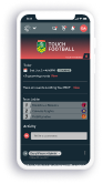
This was a large-scale project, encompassing the design of over 200 screens. These were meticulously crafted to capture the essential user flows for health technicians, enabling them to efficiently report and analyse health and safety data.
The primary challenge involved deeply understanding the industry's vernacular, specific workflows, and operational nuances. Many concepts were entirely new to me, requiring a rapid learning curve to effectively design a user experience that genuinely catered to the unique needs of a site hygienist.
To facilitate stakeholder review and understanding, all screens were also prototyped. This allowed stakeholders to easily navigate and grasp the application's functionality before it progressed to the development phase.
The Big Reveal!
This is a data-intensive application, so most screens don't have a lot of "eye-candy". That's not the intent. But the user can now navigate across companies and sites to record user health and safety data, and have it analysed in an efficient and delightful manner.