RANDSTAD: A Case Study
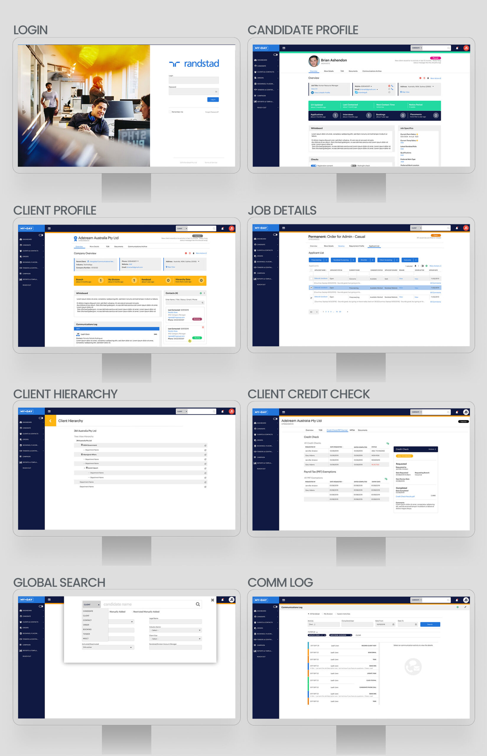
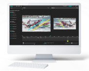
Desktop Application
Recruitment application for vetting and searching for potential candidates to fill job roles.
The
Challenge
Redesign the current dated and non-responsive application, into a modern, responsive, desktop application that is user-friendly and optimises the user experience.
The
Outcome
A fully responsive desktop application with stale features removed, modernise technology, and expedited user journeys.
Randstad had an application that was used by their recruiters to find job applicants for their clients. It served as both a customer relationship management software as well as a job applicant database. The issue was many-fold. The application had to be installed on Windows operating systems only; it was not responsive; the user interface was dated; the user experience had become bloated with mass scope creep over time. Many features were never used and the interface was badly organised that hindered recruiters from filling in forms and searching for candidates.
The software needed to be fully responsive, with a stripped-back feature set, and a complete overhaul of the information hierarchy.
Share
UX Focus Areas
In conducting the initial research, I shadowed 4 recruiters to understand how they interacted with potential job candidates and how they logged the data in the application. I was able to understand the common screens that the recruiters most often use over and over again. This was mapped out in the user flow below.
There were 3 main areas that were flagged as the most important to solve in terms of usability.
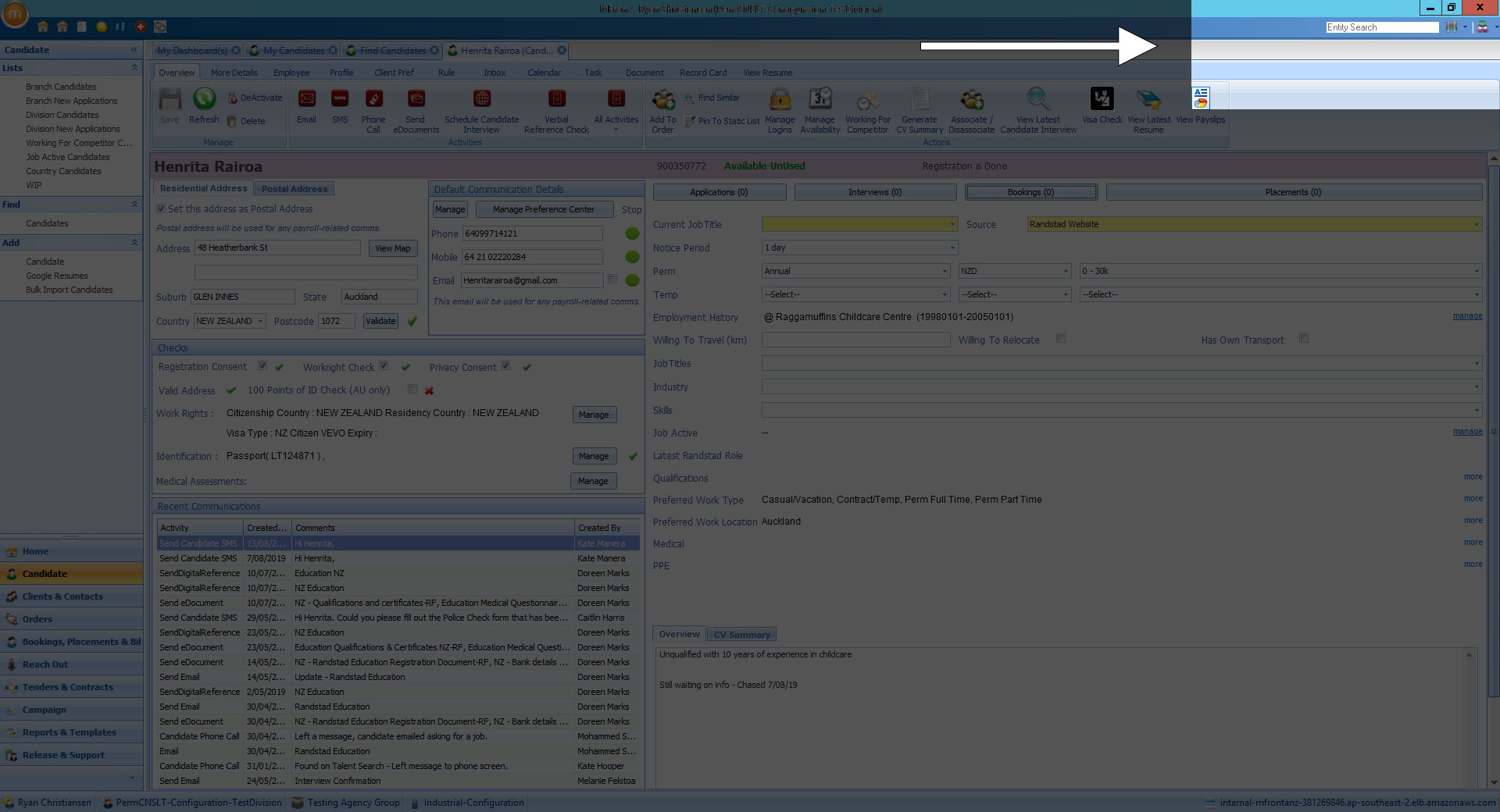
Global search
The current search functionality was not efficient in delivering results. The interface was confusing with icons to represent different areas to search. These icons were unclear and so were not often used. The search also could only search by candidate name, so phone numbers, contact details, or even reference numbers were not able to be searched which compromised usability. Lastly, the search was hidden in the top right with a small font so not easy to type into and read.
Before
After
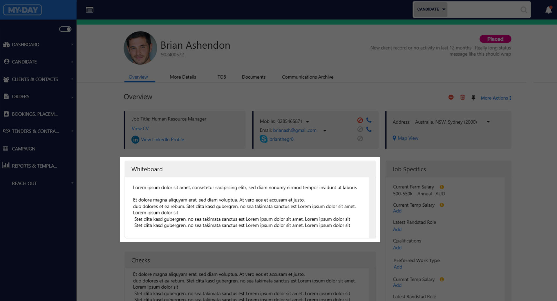
Candidate whiteboard
Problem: When recruiters are speaking to candidates they often have to take notes. There is a whiteboard that they can use, but it was placed very far down on the page as to be forgotten. So important notes by one recruiter may not be read by another. It also had strict limits on the number of characters that could be entered.
Solution: Redesign the whiteboard to put it above the fold (higher on the page) to make it more prominent to recruiters. Increase the character limit so that recruiters are free to type paragraphs of text as needed.
Before
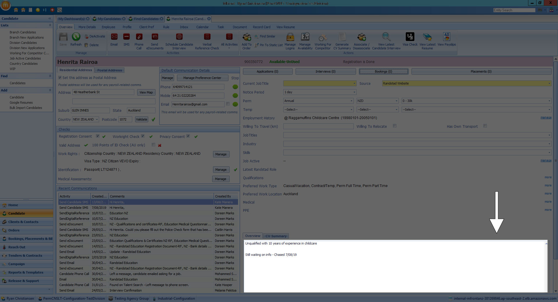
After
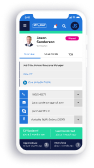
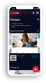
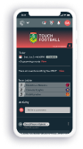
Responsive Application
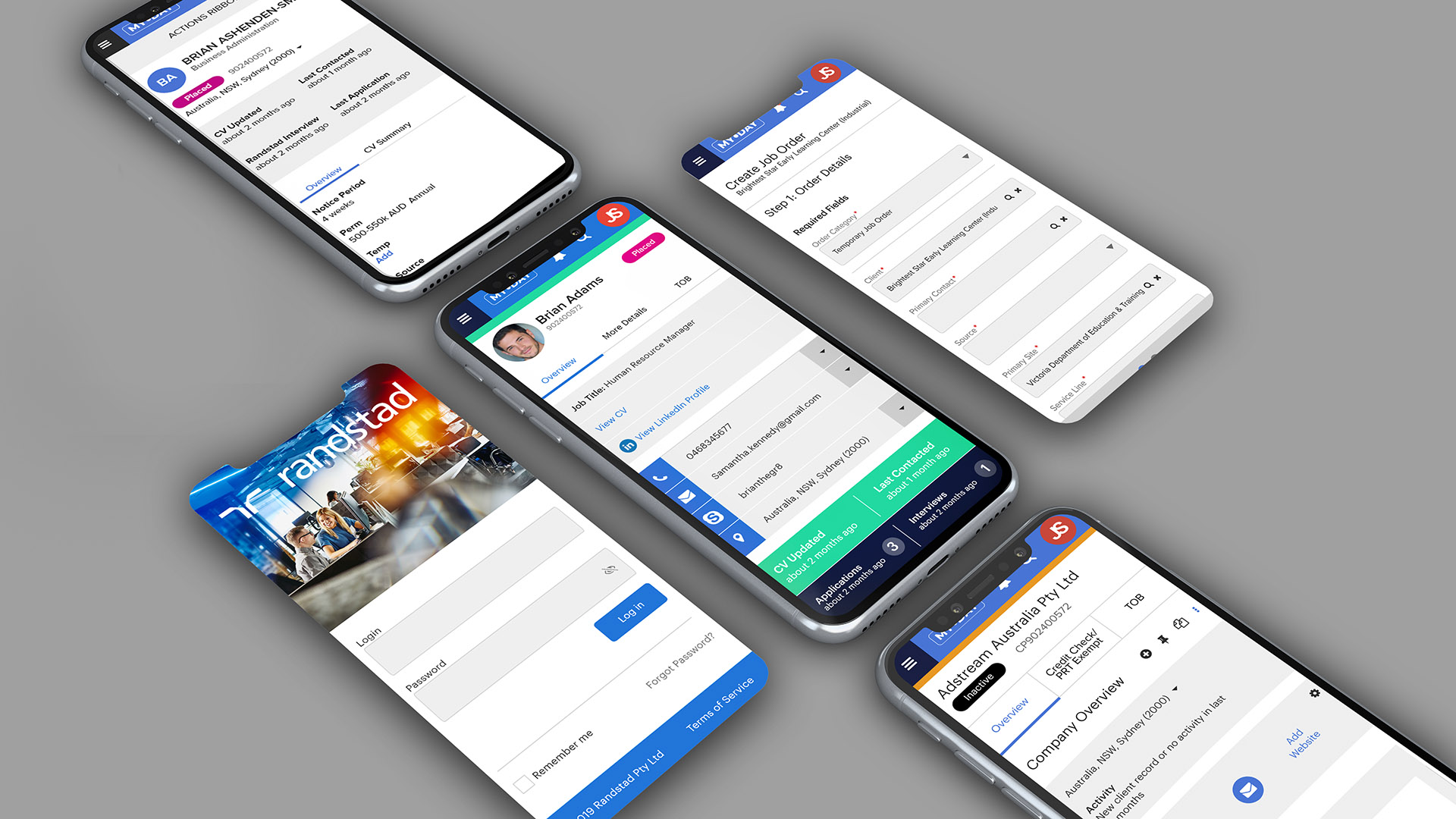
The current application was stale and dated and was built before responsive design was ubiquitous. The focus in the new design was to have me design both desktop and mobile friendly designs for every screen so that recruiters are no longer restricted to a laptop in order to work efficiently. This of course lengthened the project deadline but was a necessary and important property of the new application.
Fully responsive
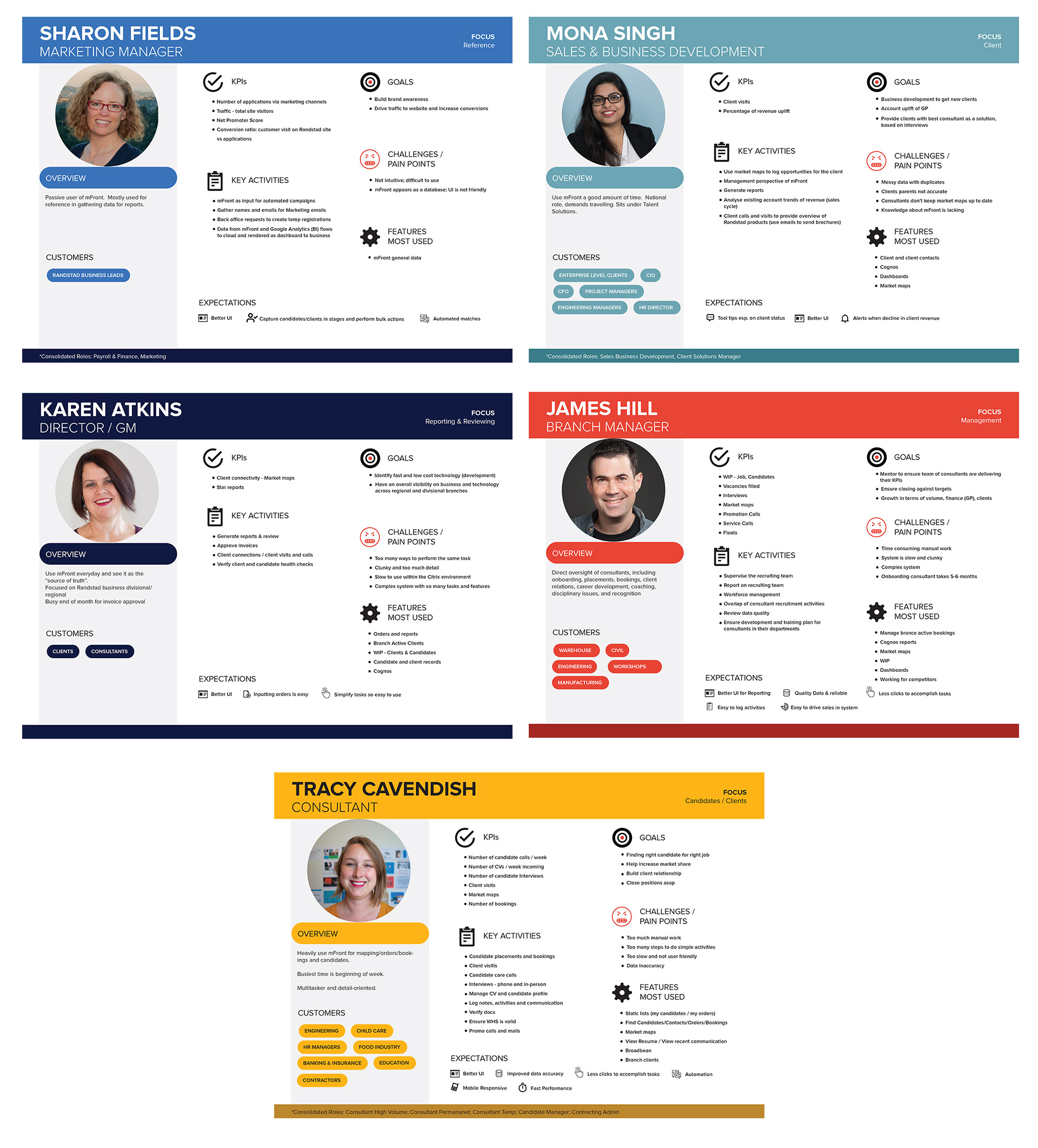
Persona Design
Five personas were identified that commonly used the application but for different reasons. Roles and permissions had to be identified based on the personas as some personas should not have access to various features within the application. For example, Marketing Managers were exposed to a smaller subset of navigation so as to not compromise the privacy of candidate privileged profile information.
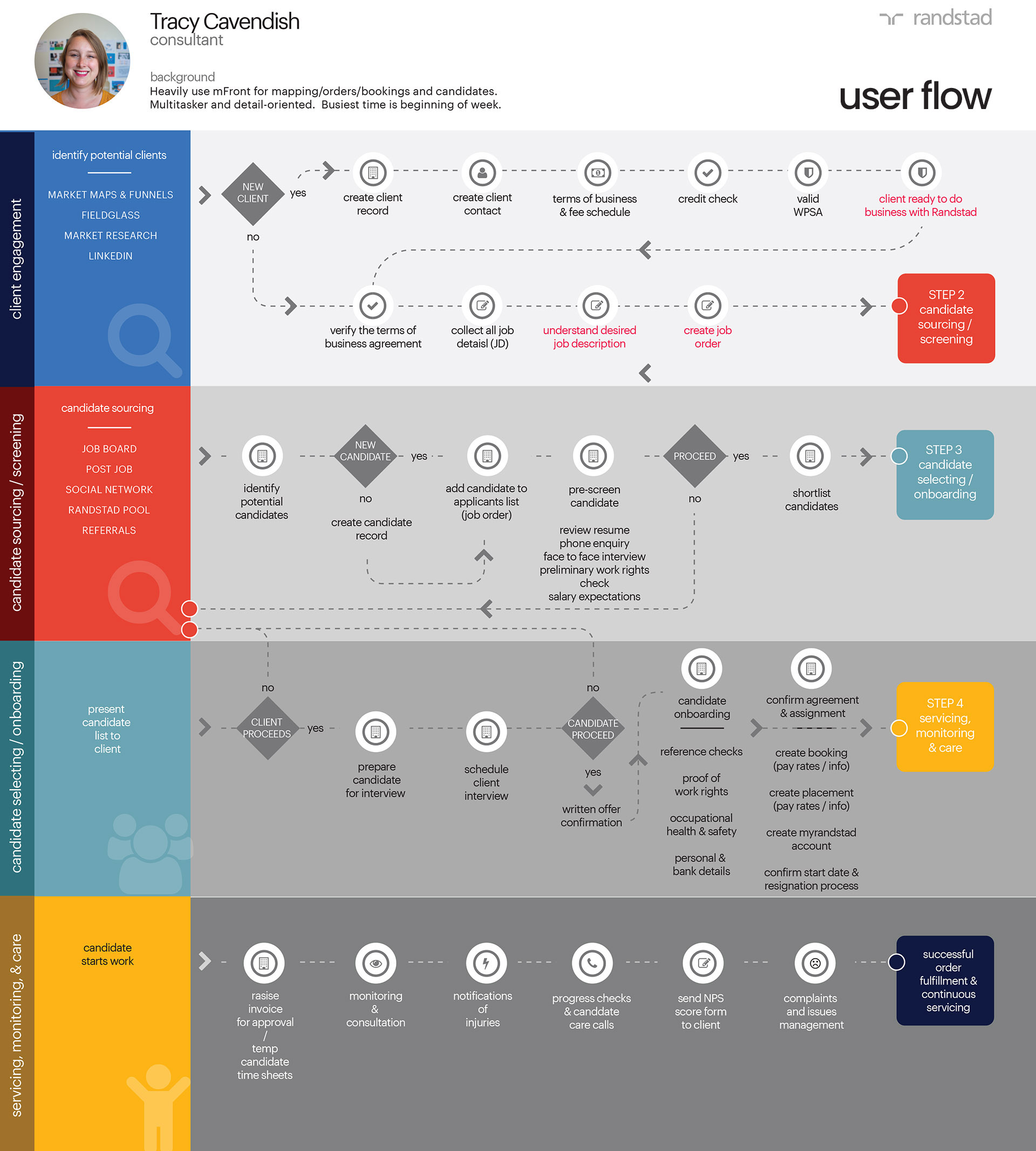
User Flow
Before designing mock-ups, the user flows were mapped out in order to best understand the various paths different personas could take. This helped to identify issues in logic and development requirements before moving to the design phase. The consultant persona was by far the most common user, so this was the user flow that I focused on for targeting the primary workflows.
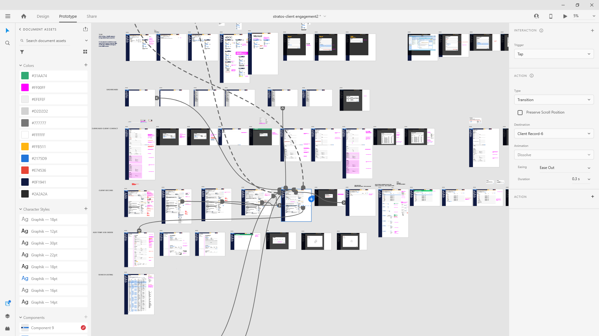
High-Fidelity Prototypes
User flows were mapped out and designed as high-fidelity prototypes. User testing and feedback was left with the client as budget constraints procluded TwoPi Code from engaging with this part of the design process.
Over 50 screens were designed and mapped out based on workshop requirements for an MVP product.
Result
The application was launched as a fully responsive application with an enhanced interface and improved user journeys. Recruiters can now access the application on mobile devices for simple tasks rather than having to access a laptop or desktop application. The interface was updated to make the application more user friendly, including updating all forms which recruiters use regularly. For example, tabbing was introduced so that the user can quickly tab through input elements making form input much quicker.